Currently it uses up and down arrows, which do not really map to "read" and "write".
This patch makes the up/down labels overridable properties, and makes the Disk Monitor
widget use the new properties to set clearer labels.
Currently it uses up and down arrows, which do not really map to "read" and "write".
This patch makes the up/down labels overridable properties, and makes the Disk Monitor
widget use the new properties to set clearer labels.
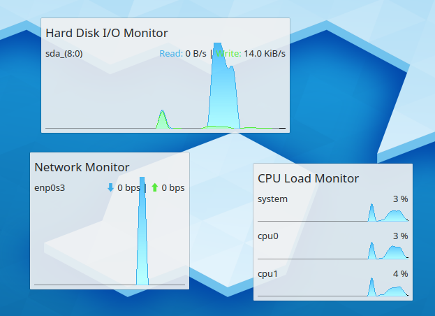
(text contrast is not great in this screenshot because my VM isn't blurring the translucent
background. Also, that's a separate issue for another patch)
| No Linters Available |
| No Unit Test Coverage |
| Buildable 12370 | |
| Build 12388: arc lint + arc unit |
In the panel, it's not ideal for sure:
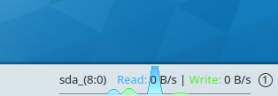
However this is a pre-existing bug; all of the monitors have a sub-optimal UI for displaying the legend when in a horizontal format.
The panel now is really bad though because the text uses more space than the arrows and the size is probably not accounting for that:
before the spacing was largely garbage
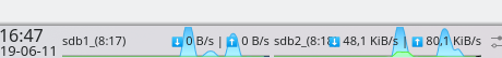
but at least not horrendously broken

The contrast between 'Read' and the blue graph also gets pretty bad when the graph goes up enough, which is hard to test on an SSD but I definitely see a problem there. Also at least on my shoddy screen the green of the 'Write' is super horrible against the grey of the panel.
So, I think that minimum size calculation needs adjustments somewhere so the graphs on the panel even have a chance of fitting the now longer labels. And quite possibly the font itself needs shadows turned on so it gets greater contrast with the graph, although admittedly I don't know if that will help.