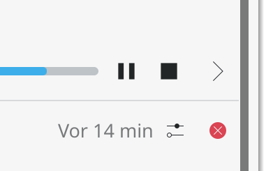
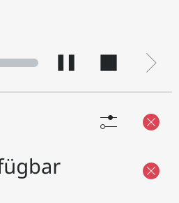
This was meant to provide some separation but since the arrow icon has so much padding around it anyway and more importantly, it breaks alignment in the list, remove it.
Details
Details
- Reviewers
hein filipf - Group Reviewers
Plasma VDG - Commits
- R120:745c60a7766c: [Notifications] Remove space between pause/stop and details button
Before
After
--ocd
Note how the stop icon (square) is aligned with the configure icon now
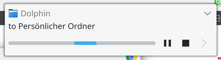
After in the popu also looks fine
Diff Detail
Diff Detail
- Repository
- R120 Plasma Workspace
- Lint
Automatic diff as part of commit; lint not applicable. - Unit
Automatic diff as part of commit; unit tests not applicable.