In the before-times, drop shadows were considered vitally important on everything, and so it was introduced to KNewStuff's dialogues as well. It was, however, never done quite right, and it's making our dialogues look all silly. So, we remove it for now, and if we still want it, we can reintroduce them in a more modern fashion.
BUG:391108
Details
Details
- Reviewers
ngraham sitter - Group Reviewers
KNewStuff VDG - Commits
- R304:e1f5782a8518: Remove pixelated border
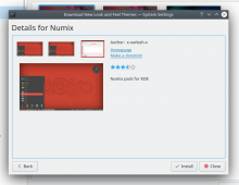
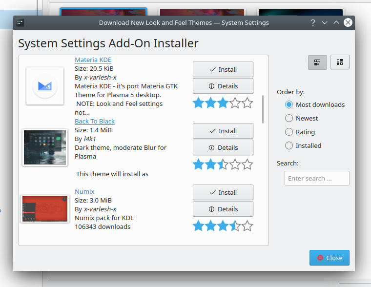
Open the details dialogue of any knewstuff listing
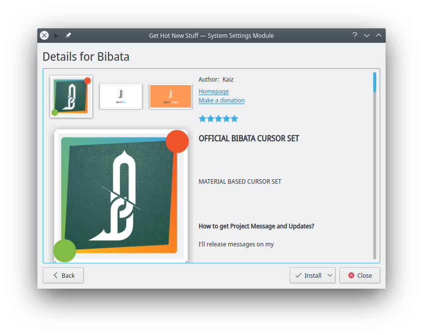
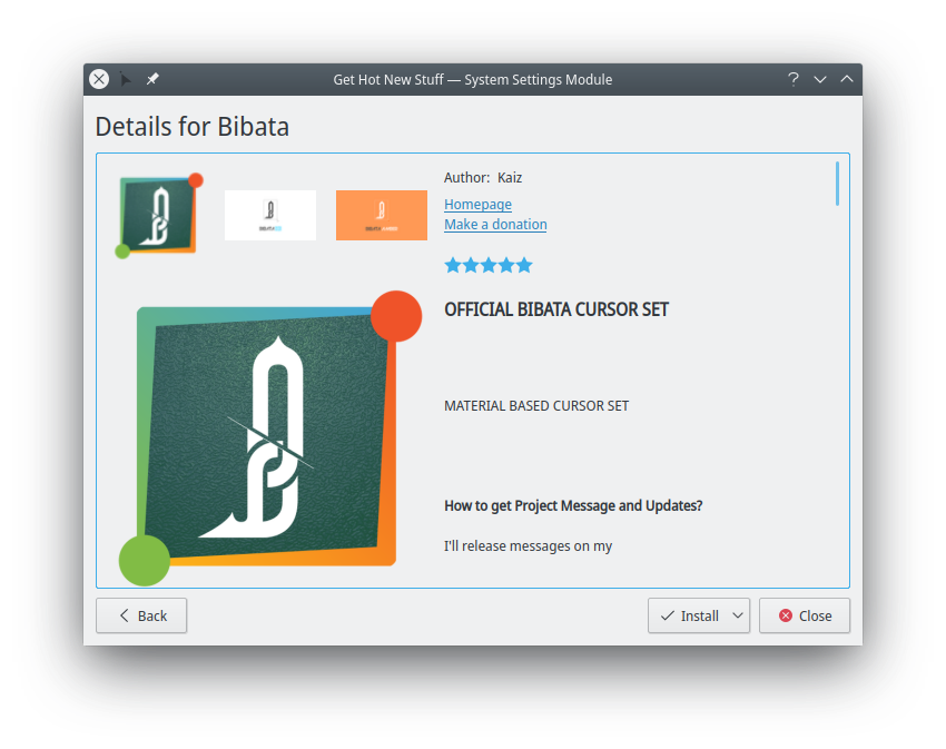
Before patch: See pixelated (and weirdly positioned) pixelated border on all preview images
After patch: See no pixelated border
Diff Detail
Diff Detail
- Repository
- R304 KNewStuff
- Lint
Lint Skipped - Unit
Unit Tests Skipped
Comment Actions
This patch doesn't apply:
 INFO  Base commit is not in local repository; trying to fetch.
Created and checked out branch arcpatch-D20693.
Checking patch src/ui/imagepreviewwidget_p.h...
Checking patch src/ui/imagepreviewwidget.cpp...
Checking patch data/thumb_frame.png...
error: the patch applies to 'data/thumb_frame.png' (afaf432793864e1fb3f1fc27aa1d53689f2243b5), which does not match the current contents.
error: data/thumb_frame.png: patch does not apply
Checking patch data/CMakeLists.txt...
Applied patch src/ui/imagepreviewwidget_p.h cleanly.
Applied patch src/ui/imagepreviewwidget.cpp cleanly.
Applied patch data/CMakeLists.txt cleanly.

 Patch Failed!
Usage Exception: Unable to apply patch!
Also it would be helpful if you used arc for your patches, since then you can see the context here in the web UI: https://community.kde.org/Infrastructure/Phabricator#Using_Arcanist_to_post_patches
Additionally, it's nice if you can add a screenshot to the Test Plan section for patches that involve UI changes: https://community.kde.org/Infrastructure/Phabricator#Include_some_screenshots
Comment Actions
This yielded less problems than last couple of times i attempted to use it. It also was a smoother experience in general, it would seem that development has progressed since last i tried to use it and it ended up hosing a few weeks' worth of work for me, which was a whole big trash fire of fun.
Additionally, it's nice if you can add a screenshot to the Test Plan section for patches that involve UI changes: https://community.kde.org/Infrastructure/Phabricator#Include_some_screenshots
Yup, totally forgot those, mabad, incoming
Comment Actions
Adding VDG because this is a visual change. To the visual commenters: This is intended as a first step, removing the old drop-shadow method (see also the related bug for a more severe version of that drop-shadow being shown very incorrectly). If we decide we do want a drop shadow, then that will want to be done separately. Note also that as we cannot guarantee the image will not have any translucent areas (which is the cause of the highly nasty look in the bug report, rather than just the basic nastiness shown in the screenshots here), we will need to do something considerably more clever than just putting a 9-slice drop image around the image (for example), which might well be a fair bit more expensive computationally than we'd probably want.
Comment Actions
+1 for the change to the large thumbnail, but I think the smaller thumbnails need something to show that they can be clicked.
Comment Actions
The problem as described in my comment where i added the VDG as reviewer is that this is what it looks like currently:
So yes, in principle i'd certainly like there to be some kind of background or outline to suggest clickability, but the current state (and any other generic rectangular background we might come up with, higher resolution or not) would yield the same suboptimal result...
Comment Actions
LGTM on a technical level. On a visual level also +1 because I hate that drop shadow with a fierce passion.
@leinir lxr says a similar thumb is also used for some of the KAboutPerson stuff in kxmlgui. it may be prudent to also remove the thumb there, I expect it looks equally dated.
Comment Actions
Hmm, certainly worth a look. It'll be less terminally broken than this is, though, as there is more tight control over the content being used there. At the same time, though, i imagine there will be a non-zero number of non-rectangular images used for those avatars as well, so... yeah, probably makes good sense to retire this particular bit of heavily assumption based design ;)
Comment Actions
QGraphicsDropShadowEffect via QWidget::setGraphicsEffect may work for that?
Another approach would likely be to write a custom blur implementation since we fiddle with qpainter anyway, TBH I think finding a way to use the effect is likely the wise use of time though.
Or... you know... rewrite the entire dialog in qml ;)
Edit: that is to say the problem is that the fixed thumb image is fixed, so any approach that makes the size of the thumb not fixed would work. So, even cutting the thumb into edges and corners and then paint them accordingly so they form a frame would solve the bug.
Comment Actions
Yes, using the dropshadoweffect certainly seems like the more appropriate way of doing this (given appropriate bounding areas and whatnot).
Or... you know... rewrite the entire dialog in qml ;)
Yes, rewriting in Qt Quick would also be good, and i kind of want to do that... though it's going to need a not inconsiderable amount of thought when it comes to design, which... i believe @ngraham had thoughts on this a while back, or perhaps the VDG?
Comment Actions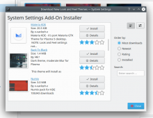
To show that a thumbnail is clickable, switching to the pointing hand cursor when hovering over a thumbnail could work.
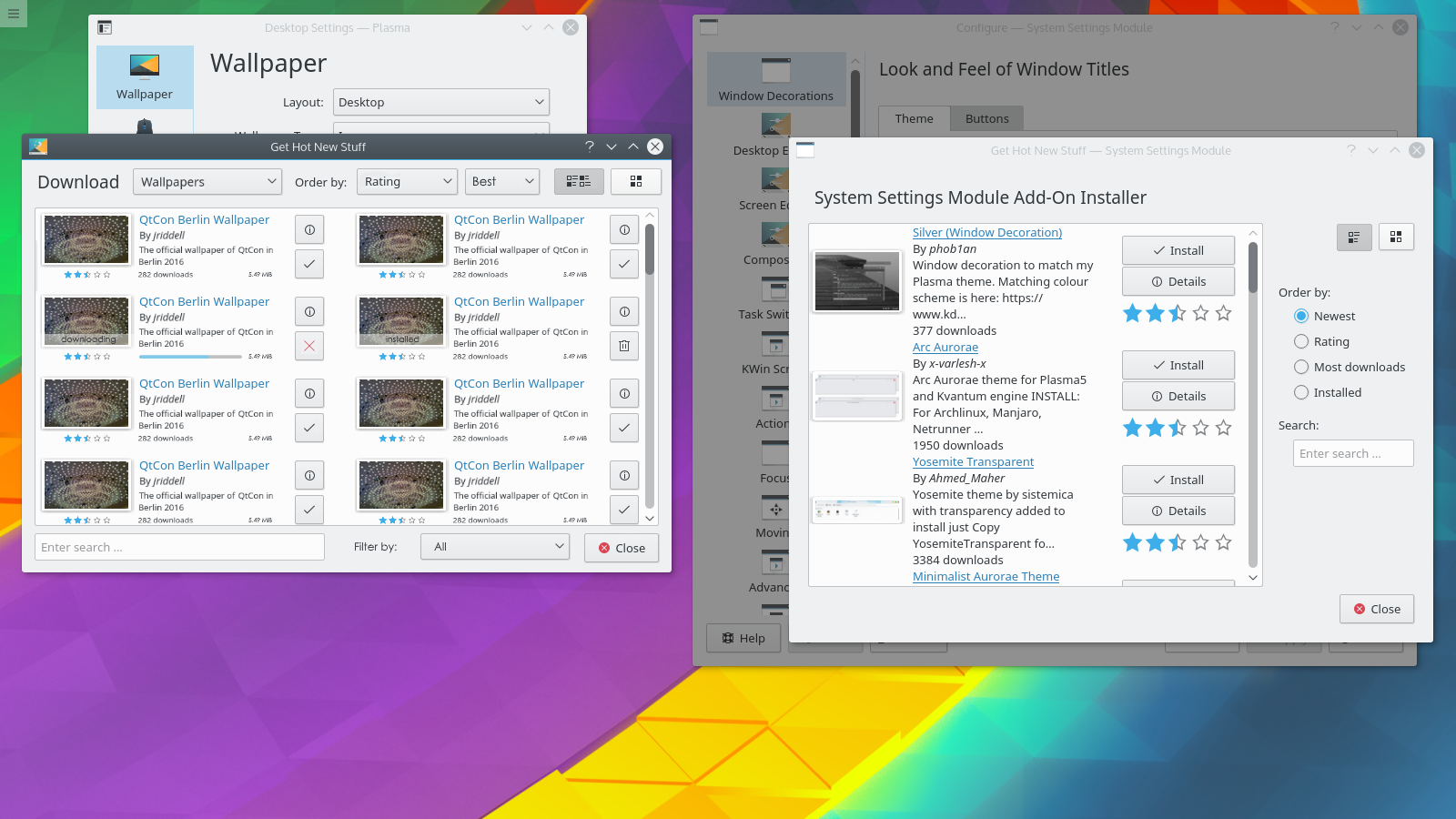
However I notice that the actual list delegates in the browse view seem to add frames and shadows to the thumbnails there, and they look okay. The frame's proportions even perfectly match the aspect ratio of the thumbnail:
Why doesn't any of that work here?
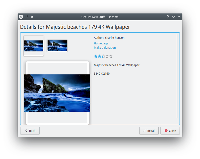
Aesthetics-wise, I'm okay deleting the shadow, but I'm less thrilled about also deleting the frame surrounding the image. Without that, the images look naked in the view, like they're just floating there, disconnected from everything:

Rewriting this in QML would be lovely (not in this patch though, obviously). I think we have a mockup of a new UI for it somewhere which I can't find right now but I'll try to dig it up.
Comment Actions
i'm afraid the "it works" is an illusion brought on by looking at content which doesn't show the issue... The main problem here is that we're dealing with user-generated content, and we can't assume that just because an image has a certain size, that space is actually filled with image data :/
Aesthetics-wise, I'm okay deleting the shadow, but I'm less thrilled about also deleting the frame surrounding the image. Without that, the images look naked in the view, like they're just floating there, disconnected from everything:
Hmm... i guess we could put an outline around things, though which would be the question, and i don't have an answer to that... (i personally like the floating thing, though i realise that's just me liking the space, without having any particularly good explicitly defined reason for it)
Rewriting this in QML would be lovely (not in this patch though, obviously). I think we have a mockup of a new UI for it somewhere which I can't find right now but I'll try to dig it up.
Thanks a bunch, just toss it at me when you've found it :)
Comment Actions
Sounds like we could handle that on the server side, to sanitize the image and delete any "empty space" around the image before handing it off to GHNS or Discover. Without that, I see what you mean that we actually can't add a frame and shadow though. So ship it!
Found it at https://forum.kde.org/viewtopic.php?t=137732, but the link to the mockup is dead. @mmustac, would you be able to dig up the original and post it here?
Also, rewriting this in QML would allow us to easily use its own tools to add a frame and drop shadow
Comment Actions
@ngraham: Fo sure, I will add my post from the forum here for better reference.
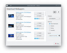
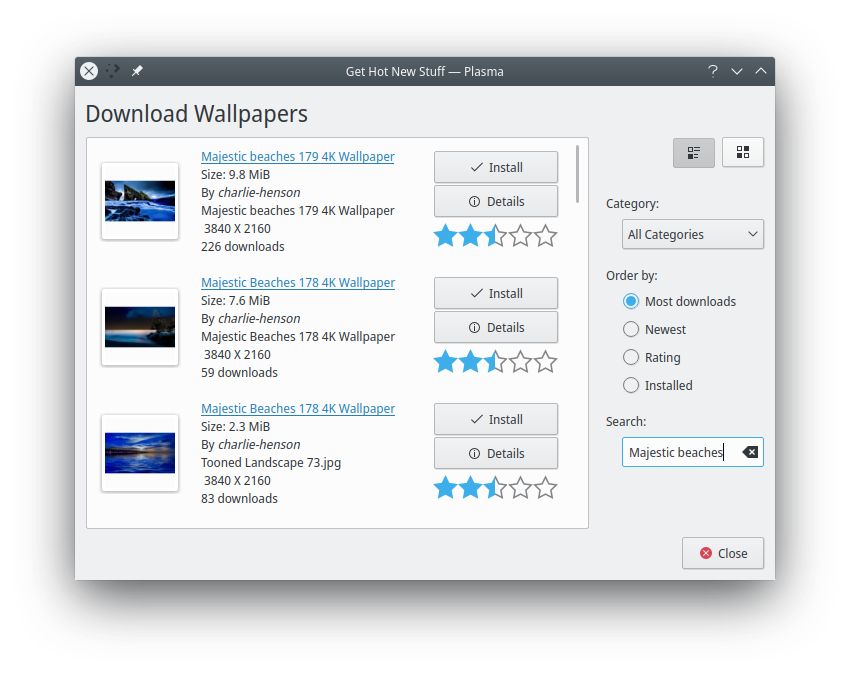
Today I thougtht about the design of the "Get new Hot Stuff" dialog. I think there is some room for improvements and to get a better overview.
I tried to put my thought into a quick mockup. There are two screenshots to compare.At first I think the "Get new Hot Stuff" needs to be an own application. No we have the KDE Store. Google has it's Play Store, Apple it's Appstore but what has KDE ?
You could start the KDE Store directly or all other places would link to it's section. The first dropdown menu would provide access to all other categorys.
The filter become also a dropdown menu and with the option to choose if I want to have an ascending or descening sorting.The "new stuff" would be displayed in two columns to see more content at one time.
Search is displayed at the bottom and a "filter by" option would you a quick overview about "all", "uninstalled" or "installed" content.
And some smaller changes, you will see.
Comment Actions
Looks great, though I would put the search field on top. It's a lot like the new GridView KCMs; maybe we can even use that template for it. The current Colors KCM looks a lot like that.
Comment Actions
That does indeed look good, and not a huge departure from what we have already, which i'm sure will make people feel quite at home in the new version :) I do wonder if we'd want to, at some point, make it look closer to Discover, but certainly for now this seems a much more sensible direction.
Hmm! GridView KCM template, that is worth having a look at, yes :)