There was a small gap in the corners of the thumbnailArea highlight rectangle that was noticable on dark thumbnails.
Details
Details
- Reviewers
filipf - Group Reviewers
Plasma VDG - Commits
- R296:f18d43b7ffd8: [GridDelegate] Fix gaps in corners of thumbnailArea highlight
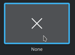
Before:

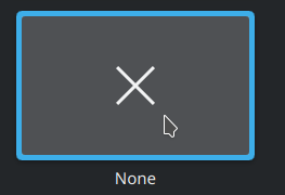
After:

Diff Detail
Diff Detail
- Repository
- R296 KDeclarative
- Branch
- grid-delegate-rectangle (branched from master)
- Lint
No Linters Available - Unit
No Unit Test Coverage - Build Status
Buildable 10288 Build 10306: arc lint + arc unit
Comment Actions
- Remove radius from thumbnailArea highlight
Having the same radius as the thumbnailArea allowed it to fit perfectly when the thumbnails weren't filling the corners of the thumbnailArea, but it still left a small gap on thumbnails that completely filled the thumbnailArea. Removing the radius makes the highlight slightly overlap with the inner corners of the thumbnail outline, but it's not really noticeable.
Comment Actions
It's probably going to be more noticeable for High DPI users. It seems like there must be a way to fix this rather than just removing the thumbnail radius.
Comment Actions
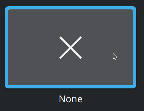
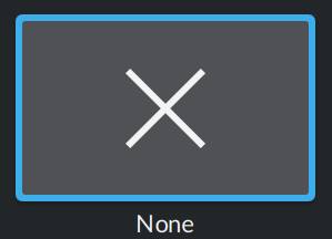
I could remove the radius for the thumbnailArea as well. Here's how the current change looks at 2x scaling:
Comment Actions
Another alternative would be to turn the thumbnail outline into a real outline instead of a rounded rectangle behind the thumbnailArea. Then it could go on top of the thumbnailArea and the thumbnail highlight could fit perfectly inside of it. This would give previews of rectangular images rounded corners and is significantly more complicated than the current change, but I feel like it should be possible.
Comment Actions
Sorry, I'm just busy right now and I'm not that familiar with QML, so it won't be quick and easy for me.
Comment Actions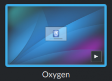
You can fix the rounding bleeding into image previews by doing the following at line 116:
radius: thumbnailAvailable ? 0 : Kirigami.Units.smallSpacing

Comment Actions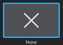
Which still leaves you with fixing the gaps when there's not thumbnail. I'd suggest to do:
radius: thumbnailAvailable ? 0 : Kirigami.Units.smallSpacing / 2
and call it a day :P
Comment Actions
Unfortuantely, that still leaves small white corners on the thumbnails that don't take up the entire area.

Comment Actions
In practice, the thumbnail delegates are much smaller; is anyone gonna notice that (famous last words)?
Comment Actions
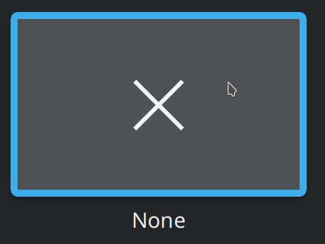
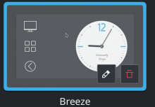
If you and anyone else reviewing this patch thinks it's OK, I'll just remove the radius for simplicity and consistency, but you seemed like you didn't want small bits of whiteness in the corners:
BTW, that last screenshot you quoted has 3x scaling
Comment Actions
Anyone want to approve or request changes? It's not perfect, but it's a simple improvement. The ideal solution would require me to work around a problem with QML where images can't have their corners rounded by a parent object's border radius.