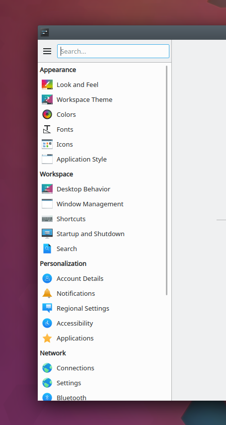
Ever since increasing the list item size to accommodate 32px icons, System Settings'
sidebar has felt somehow wrong to me. Though the icons are indeed pretty, and the
problem with small monochrome icons has been resolved, the information density is now
quite low. Since the list is very long, the amount of scrolliness is increased and
there's a low of whitespace.
This RFC patch explores the impact of reducing the icon size down to the default value
for Kirigami list items. The information density increases and the whole thing feels
better to me. On the other hand, the icons don't look as good because they're scaled to
fit in a 22px size. Also, touch-friendliness is reduced.
I'm not married to this idea but I thought I'd throw it out there. Comments are welcome.