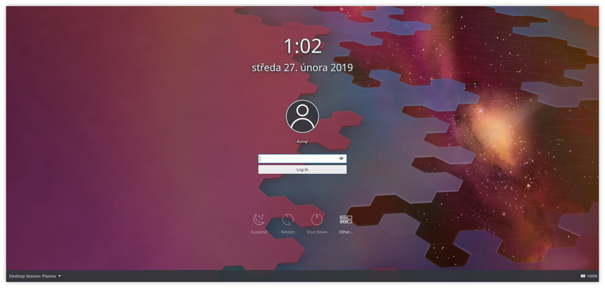
As a dependent revision of D19369, this patch adds a panel to the bottom in order to make sure the buttons found there are legible.

Diff Detail
Diff Detail
- Repository
- R120 Plasma Workspace
- Branch
- sddm-theme-panel (branched from master)
- Lint
No Linters Available - Unit
No Unit Test Coverage - Build Status
Buildable 8917 Build 8935: arc lint + arc unit
Comment Actions
Hey can you please rename the footer background to footerBackground because footer's used elsewhere
id: footer
to
id: footerBackground
And rename footerLayout back to footer, because it's used in sddm (Connections, line 355).
Also, you might want to add footerBackground.opacity = 0 there as well.
One more thing - it's a little dark, how's opacity: 0.6 sound (I'd prefer that we set the same opacity we'll be using for the action button backgrounds).
P.S. Indent the lines too :D
Comment Actions
-1
I don't think it looks very nice. If you're worried about those UI elements not being visible, wouldn't it be better to move them towards the center? Then, if it's necessary, you can add a background to all the floating UI elements so that they're all visible.
Comment Actions
Center how? Vertically?
Where would the elements be placed (with respect to the Clock / user names/avatars / action buttons)?
Comment Actions
I would prefer something less intrusive like a gradient.
wouldn't it be better to move them towards the center?
People not finding the keyboard layout button and other controls tucked in the corners came up a lot in the past, so that could be a good idea.
Comment Actions
The bottom panel was always my least favorite element of my previous design and I share others' reservations. +1 for the idea of making these more like the actionbuttons, and putting them closer to the center of the UI with their own backgrounds.
Comment Actions
Horizontally and maybe vertically. They could fit in the area above or below the Suspend, Reset, Shut Down, Other buttons.
Comment Actions
Back in the day, when I proposed changes to these elements, I put them on the center. People said that it looked crowded, boring, etc... However, my reasoning was because the selections are too far in the corners. It wasn't a problem with smaller older screens but it would become a problem with ultra-wide, 4K monitors, etc. The options would be too far from the center where the user is. I don't know that the bar at the bottom is a good solution overall. But it does bring attention to the area.
I can help with defining how they can look in the center?
Comment Actions
That would be of great help, please do. I agree there could be better solutions than a panel.