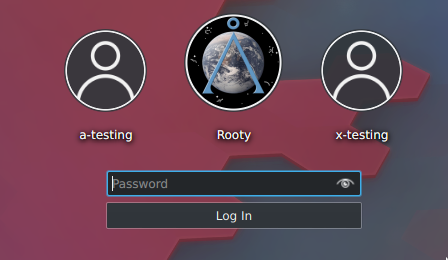
This patch makes the user avatar that is selected (in focus) larger than the other unselected/deselected avatars surrounding it (provided there is more than one user).
Details
Details
- Reviewers
ngraham - Group Reviewers
VDG - Maniphest Tasks
- T10325: 5.16 Login screen improvements
- Commits
- R120:458576b2b5db: [sddm-theme] Enlarge user avatar in focus
Diff Detail
Diff Detail
- Repository
- R120 Plasma Workspace
- Lint
Automatic diff as part of commit; lint not applicable. - Unit
Automatic diff as part of commit; unit tests not applicable.
Comment Actions
As this is meant to be a replacement for opacity: isCurrent ? 1.0 : 0.5 I would suggest to remove it in this patch.
Comment Actions
We can tweak the circle color based on containsMouse, but opacity has to go (T9658#170319)
Comment Actions
Perfect functionality! Now we need some more bling. :) I'd like for the size to animate as well.
A sane way to do this might be with a ScaleAnimator (https://doc.qt.io/qt-5/qml-qtquick-scaleanimator.html), and then do a tiny bit of refactoring to adjust the scale rather than changing faceSize.
Comment Actions
But wouldn't that involve arbitrary multiplication as opposed to relying on standardized units?

Comment Actions
Hmm, that's a shame. Well, regardless of implementation, I'd like to see some form of animation when the size changes. :)
Comment Actions
But it looks very smooth already. It's choppy in sddm-greeter but on the actual login screen it looks pretty good (more to the point - it looks very much the same as the transition from the user list screen to the prompt screen).
I also think that if we're going to opt for an animation effect, I'd like to do it in another patch :D
Comment Actions
Heh, I'm sure some old SDDM (maybe even LightDM) theme did that. There was a whole Carousel system.
If you do animate, generally I've found that animating width won't do what you want, it'll cause the text to re-lay out and that looks weird.
Using Item.scale with a correct transform origin looks smooth, but obviously you lose some resolution in the text.
Comment Actions
I would agree, if there is no visual work using effects to ease the transitions between states, then it looks pretty unrefined. Dave, is there anything that would help here?
Comment Actions
Sure, but I'd like to use the bling in another patch :D
It seems to transition fine, it doesn't just "pop" into a larger size
But I'm afraid I'm going to have to rebase this too because of D19433
Comment Actions
This seems to be how they did it
source: visible ? "user-identity" : undefined
visible: (face.status == Image.Error || face.status == Image.Null)
Which isn't all that different from how this diff does it.
It still looks fairly animated to me :D
Comment Actions
P.S. Should we use "live: true" or just delete the line? Because it's true by default, but this makes it clear that it shouldn't be live: false
Comment Actions
Perfect. Shipit!
FWIW I think being explicit is better than implicit when there's any possible chance of confusion or misunderstanding.