using a better height and removing the overpainting stuff
Details
Details
I did try a bit to zoom and use different documents, it looks ok, but it did look ok before in most cases, too :/
Diff Detail
Diff Detail
- Repository
- R39 KTextEditor
- Lint
Automatic diff as part of commit; lint not applicable. - Unit
Automatic diff as part of commit; unit tests not applicable.
Comment Actions
I think that this change will fix bug 403470 as well.
Suggestion: in updateFontHeight() in katerenderer.cpp, add a comment saying that the line height needs to match that which is used by Qt, since Qt may handle some parts of the drawing, e.g. selection backgrounds, and a mismatch will cause drawing issues. Perhaps also say where in the Qt code this can be looked up.
Comment Actions
Hmpf :/
I improved my commit message and amended, but arc at it :/
I will BUG: and CCBUG: the bugs manually :/
Comment Actions
We trade one bug for another. Which one is worse?
Next Frameworks Tag is on Saturday, 2nd, i.e. in 2 days. Revert, or give it a try?
PS: This is never going to be fixed, since some lines (in this case with emojis, but could also be bidi text or arabic letters) , suddenly need another height. Call it "broken by design", but we are struggling with this at least 5++ years.
Comment Actions
We trade one bug for another. Which one is worse?
Without having had a detailed look, it seems to me like the problem reported by @rjvbb might be caused by the removal of the workaround with the second drawing passes in this commit (the changes in src/view/kateviewinternal.cpp), which probably results in more issues with oversized characters. This is independent from the other change (in src/render/katerenderer.cpp), which adapts the line height and fixes the bug with the bottom of lines being cut off. So, one might try to revert the removal of the second drawing passes, but keep the change to the line heights.
Comment Actions
Next Frameworks Tag is on Saturday, 2nd, i.e. in 2 days. Revert, or give it a try?
TBH I didn't notice any issues with the before code and am pretty certain I couldn't do better. FWIW I noticed that Scribus (1.5.5) filters out pure emoji fonts, from what I understand because they lack information needed for proper scaling. That probably explains why lines holding these glyphs are lower despite the fact that the glyphs are taller than the text.
The summary of this diff reads a bit as if it doesn't noticeably improve behaviour so my vote would be on reverting.
Comment Actions
The summary of this diff reads a bit as if it doesn't noticeably improve behaviour
The line height change (a part of this commit) does noticeably improve behavior for the font that is used on my system.
Comment Actions
That is a good observation: @cullmann Could you give this partial revert a try?
I'll try to do that too, tomorrow.
Comment Actions
If you keep the overpainting, you will just overpaint the next line partially with it, that won't help that much, IMHO.
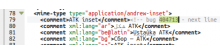
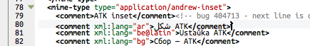
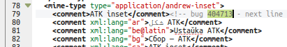
Take a look at bug 404713.
We just can't use one fixed height for such texts.
Comment Actions
We just can't use one fixed height for such texts.
You can, but it'd have to be the maximum of all lineheights (of the entire document or of the visible section).
Comment Actions
If you keep the overpainting, you will just overpaint the next line partially with it, that won't help that much, IMHO.
Take a look at bug 404713.
I totally agree, but this is a different issue that is out of scope here as far as I see. Bugs 403868 and 403470 can and should be fixed by the proposed line height change. This will not fix the other bugs 404713 and 404907 though, which are a different issue and unaffected by this. Thus I think that the overpainting workaround should be kept until a better solution is found for the latter bugs.
Comment Actions
(background: full revert; foreground partial revert (only kateviewinternal.cpp))
So it seems that the partial revert works; you lost me re: what would break again by doing that?
(background: full revert; foreground partial revert (only kateviewinternal.cpp))
Comment Actions
Just load the XML file from bug 404713.
Before this changes here, you did overpaint the next line randomly with the "oversized one", now you "cut" the oversized line.
In both cases, one line is garbage.
Comment Actions
Sorry when I'm wrong, but it sounds to me that this bug is somehow relatated or maybe a solution, there is patch offered.
Bug 328837 - Add configurable line height to katepart
Comment Actions
Just load the XML file from bug 404713. Before this changes here, you did overpaint the next line randomly with the "oversized one", now you "cut" the oversized line.
I don't know where to look specifically in that huge file. I do notice that with the partially reverted commit some lines are very close to one another, possibly even certain glyphs being superimposed, and on certain of those lines the cursor gets decorated by what looks to be a '>'.
What I do NOT see is lines being painted over by whitespace, which is worse in terms of readability.
Bug 328837 - Add configurable line height to katepart
Apparently,
There's a problem, though: selection gets inconsistent.
I haven't checked if that's the case (nor if the patch still applies).
The idea is good though, and I'm a bit surpised that there could be problems with it given that KTE already determines the lineheight to use (and changing the way that's hardcoded doesn't lead to selection problems).
You could even make that lineheight scale factor a per-document setting (I could easily imagine someone wanting lines to be more separated in code than in prose, for instance).
Comment Actions
We can not arbitrary scale the height, that must match what Qt does, else you get maximal ugly empty trash in-between the lines, e.g. if you partially select stuff or have different backgrounds for some glyphs.
Comment Actions
FWIW, Calligra Words can (idem QWE and QWK) so I guess you mean KTE cannot without a complete rewrite of how text is displayed?
EDIT: how about NON-random lineheights, i.e. a small selection of alternative lineheights (1.5x, 2x, 0.75x)?
Comment Actions
I have no idea how they do that, but we paint line by line ourself, if we just change the height, you get interleaved "something" between the lines.
And I don't see a benefit in supporting that at all, how should the user set it to the "right value" if it can differ per line?
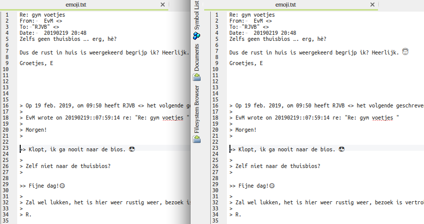
I added now a cut down example of the xml file from bug 404713 to our repo: cdf03c8546bdeefae9b52bd2600f29d8e06f7493
Just search for 404713 in that file and you will get above the line that either overpaints or is cut.


Comment Actions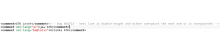
I guess the previous situation is still more practical, since by temporarily adding a newline there below the oversized line, it is at least possible to edit that line. With the line cut off, it is impossible to edit. Also, in cases where a line is only slightly oversized (as with the emoji example), with the overpainting it might look just fine, whereas with the cutoff it won't look fine.
FYI, below is a screenshot of how the new example looks on my system ((K)ubuntu 14.04, Monospace font, normal style, size 9, which I believe is the default), after applying the line height fix: it looks perfectly fine.

Comment Actions

Actually, if you use a "proper" font, it all works fine with this patch, too.
Here screenshots using DejaVu with current KTextEditor master.

The overpainting on the other side leads to ugly effects that even selections cut out parts of the line below.
I would rather keep the current behavior and let people use sane fonts if the want unicode.
Comment Actions
I would rather keep the current behavior and let people use sane fonts if the want unicode.
That's not current acceptable IMHO, not with the cumbersome way of selecting the font.
If proper document display depends on "user picking a sane font", they should have a drop-down list where they can pick one quickly, and with a clear and easy way to make this a temporary or a document-specific choice.
Also, while it's clear that you cannot expect everything to work properly with any font, accepting that the user just has to pick the right font to avoid lineheight issues is a slippery slope that I'd fear could easily lead to hardwiring a limited selection of typefaces just to avoid bug reports. That would be fine (AFAIAC) for Kate, but not for the framework that provides the editor component for more complex applications like KDevelop.
Rather, an effort should be made to implement support for variable lineheights (GSoC? junior job?)
how should the user set it to the "right value" if it can differ per line?
The same way they can pick a "sane font"? FWIW, I'm using Ubuntu Mono, that's supposed to be pretty complete and should be sane too.
The "right value" here would be a value that works for all lines = the tallest lineheight that gives proper line separation everywhere. My guess would be that you will already catch most situations with a choice of 1.5x and 2x .
And I don't see a benefit in supporting that at all
There are situations where I would welcome the possibility to increase line spacing on the fly, for improved readability - I'm certain I'm not the only one.
Comment Actions
If somebody provides a patch that allows artifact free line height modification, I will happily merge it.
The same for any improvement to the line height computation. It is only fixed for all lines to make it easy (and fast). If somebody fixes that all, I am more than happy.
But now the state is just like it was before: If you have a font that does fallbacks for some glyphs and therefore doesn't take their "real" height into account, we mess up.
Comment Actions
But now the state is just like it was before: If you have a font that does fallbacks for some glyphs
It's the fontengine that handles this of course ;)
Note that on Unix the fallback mechanism is actually provided by/through fontconfig, so there might be things to configure at that level.
and therefore doesn't take their "real" height into account, we mess up.
Actually, if that's really what happens (= information provided the font is ignored instead of absent as is apparently the case with the emoji fonts) then that c/should be considered a Qt bug.
To be certain: does KTE obtain its lineheight information from a Qt method that takes an entire line, or could it?
Comment Actions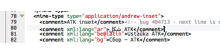
On, with the partially reverted patch:
CoreText font engine:
FontConfig font engine (= identical to the one on Linux; FreeType & FontConfig have the Infinality patches):
Font: Ubuntu Mono 12pt.
I find neither particularly troublesome; the latin characters remain readable.