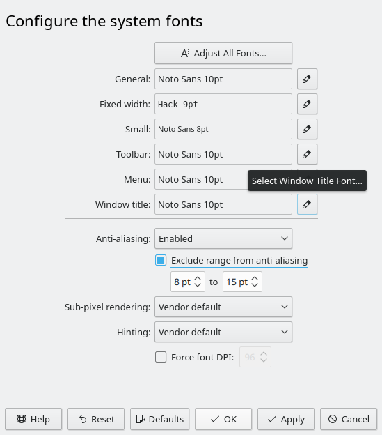
Makes some improvements to the Fonts KCM UI, like applying the KDE HIG, adding icons and tooltips to buttons and improving the buttons, updating strings and more.
| ngraham | |
| rooty | |
| davidedmundson |
| Plasma | |
| VDG |
Makes some improvements to the Fonts KCM UI, like applying the KDE HIG, adding icons and tooltips to buttons and improving the buttons, updating strings and more.
Open the Fonts KCM.
| Automatic diff as part of commit; lint not applicable. |
| Automatic diff as part of commit; unit tests not applicable. |
No suggestions for improvement! I guess because this has already been discussed for weeks in the IRC channel. :)
I don't like the look of the | character between the font name and the font size. I think the existing "Noto Sans 10" format looked better, but I'm not going to formally request changes.
That would be fine too since it reads like English. The | character makes it seem like we're mixing TUI with GUI.
The other ordering is more English-like, but your suggestion would probably be fine too.
Please use more descriptive messages than "Improve the blahblah".
Practically every single commit aims to improve the product.
I added the word UI, what do you suggest as a title?
I can't think of anything better, because this changes many different things.
Perhaps "Modernize" would be a more specific word than "Improve"?
Not really. There's nothing "modern" about putting an icon on a button.
adding "UI" helps clarify it's not behavioural changes. That'll do.
From a dev POV, ship it. But get a ship it from someone in VDG too for the string changes.
Show pt after font size and remove seperator in the font preview. Also apply the KDE HIG even more.