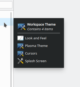
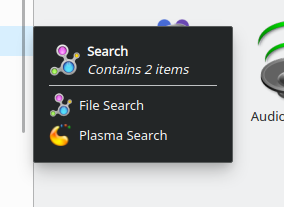
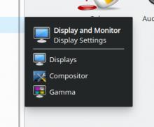
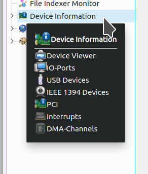
[Tooltips] Use 24px size for children to improve display, just like KInfoCenter
AbandonedPublic

Authored by ngraham on Feb 6 2019, 9:58 PM.

Details

Reviewers
None
Group Reviewers
VDG
Summary

Adopt the same code that KInfoCenter uses for this tooltip and hardcode a 24px icon size
for tooltip child items instead of using the KIconLoader::MainToolbar size (which is
not really semantically correct anyway, since this is not a main toolbar).

By hardcoding 24x24, we ensure that KIconLoader downscales the nice 32x32 color versions of the icons rather than using the 22x22 versions of some of these icons, which we don't want.

BUG: 386748
FIXED-IN: 5.12.8
Test Plan

Diff Detail

Repository
R124 System Settings
Branch
Plasma/5.12
Lint
No Linters Available
Unit
No Unit Test Coverage
Build Status
Buildable 7961
Build 7979: arc lint + arc unit
ngraham created this revision.Feb 6 2019, 9:58 PM
Restricted Application added a project: Plasma. · View Herald TranscriptFeb 6 2019, 9:58 PM
Restricted Application added a subscriber: plasma-devel. · View Herald Transcript
ngraham requested review of this revision.Feb 6 2019, 9:58 PM

Even if it did load MainToolbar icon size, why does that make them invisible as per the bug report?

Because the default MainToolbar size is 22x22, at which size we have various monochrome versions of color icons. So for example it would display the ugly 22px monochrome version of the Fonts icon, which did not change its color due to a bug in the way this tooltip is generated (it was never intended to draw monochrome icons because it does not invoke their color-changing behavior).

By hardcoding a 24px version, KIconLoader correctly fails to find a 24px monochrome version of these icons and instead grabs the 32px color version and scales it down, which looks much better.

ngraham edited the summary of this revision. (Show Details)Feb 6 2019, 10:07 PM
ndavis added a subscriber: ndavis.Feb 6 2019, 10:10 PM

I thought we primarily used 22px and not 24px? While it does make the icons look more consistent as long as there are no monochrome 24px versions (there are some) should there be an exception to the norm? If so, we would have to remove all 24px monochrome icons. That might not be such a big deal anymore and I'm not aware of any apps that require 24px icons. I think 32px scaled down to 24px also looks better than 32px scaled down to 22px, so I would be in favor of that solution.

ngraham updated this revision to Diff 51060.Feb 6 2019, 10:10 PM

Add a comment

I thought we primarily used 22px and not 24px? While it does make the icons look more consistent as long as there are no monochrome 24px versions (there are some) should there be an exception to the norm? If so, we would have to remove all 24px monochrome icons.

No, just all monochrome 24px versions of color preferences-* icons, of which there are only two:

/usr/share/icons/breeze$  find */24/ | grep -i preferences-
actions/24/preferences-activities.svg
actions/24/preferences-other.svg

None of these are currently used by any KCMs (Activities uses your nice new preferences-desktop-activities icon).

Alright, that sounds reasonable.

Next question: KInfoCenter's version of this tooltip currently hardcodes 32x32 for the size of the parent icon above it rather than using the KIconLoader::Dialog size (which defaults to 32x32).. Should we do that here too so that there's never a case where the parent icon could be smaller than the child icon for the corner case of a user who has set the KIconLoader::Dialog size to something smaller than its default?

Next question: KInfoCenter's version of this tooltip currently hardcodes 32x32 for the size of the parent icon above it rather than using the KIconLoader::Dialog size (which defaults to 32x32).. Should we do that here too so that there's never a case where the parent icon could be smaller than the child icon for the corner case of a user who has set the KIconLoader::Dialog size to something smaller than its default?

Is hardcoding a good idea? What if a new size was added to KIconLoader with a default size of 24px? Then we could reuse the same thing in Plasma's Kicker menu to make the icons more colorful and make the 32 and 48 px icons scale down better.

That's rather a can of worms, since the 22px size is used all over the place. If we added a 24px size in addition (rather than replacing the 22px size), it would be weird; why have both 22 and 24px sizes. But if we replaced 22px entirely, a lot of things that are currently correctly monochrome would become color.

The idea would be that 16 and 22px are for monochrome and 24px and above could be for color.

ndavis added a comment.Feb 7 2019, 6:12 AM

Oh I understand now. These sizes are user configurable. In that case, I suppose it doesn't make sense to add a 24px option and hardcoding is probably fine as long as it's compatible with UI scaling for HiDPI screens.

rooty added a subscriber: rooty.Feb 7 2019, 6:28 AM

i think this is fine because the parent already behaves this way so

broulik added a subscriber: broulik.Feb 7 2019, 8:00 AM

What about non-SVG icon themes like Oxygen? They will look awful when downscaled from 32 to 24.

Doesn't look terrible with Oxygen icons to me.

Here'w how it already looks in KInfoCenter:

And in System Settings with this patch:


Doesn't look terrible with Oxygen icons to me.

That compositor icon is out of the question.

So if this isn't an acceptable solution, then what we need to do is remove all the 22px monochrome versions of icons that have colorful 32px-and-larger versions.

GB_2 added a subscriber: GB_2.Feb 7 2019, 3:01 PM

So if this isn't an acceptable solution, then what we need to do is remove all the 22px monochrome versions of icons that have colorful 32px-and-larger versions.

What I proposed in T10413 :-)

ngraham abandoned this revision.Feb 7 2019, 3:04 PM

All right, let's go do it. I'll submit the inverse of this patch to KInfoCenter, which will make its tooltips consistent with System Settings.