This patch adds 16 px SVGs of gnumeric-font.svg and creates a symbolic link for both the 16 px and 24 px versions (font.svg),
Details
Details
- Reviewers
ndavis GB_2 ngraham - Group Reviewers
VDG - Commits
- R266:f0cdfe442bea: [breeze-icons] Add 16px versions of gnumeric-font.svg and link gnumeric-font.
Diff Detail
Diff Detail
- Repository
- R266 Breeze Icons
- Branch
- gnumeric-font-16px (branched from master)
- Lint
No Linters Available - Unit
No Unit Test Coverage - Build Status
Buildable 7954 Build 7972: arc lint + arc unit
Comment Actions
Ask and ye shall receive, eh!?
To channel @ndavis, it would be nice if you could run these through an optimizer. :)
Comment Actions
Haha it just took me a while to figure out how to resize them... Inkscape truly is the gift that keeps on giving
Comment Actions
Hmm somehow I missed this. Here's a way to optimize it with a utility that's available in most distro repos (scour, python-scour):
scour input.svg output.svg --enable-viewboxing --enable-id-stripping --enable-comment-stripping --shorten-ids --remove-descriptive-elements --create-groups --strip-xml-space --strip-xml-prolog --nindent=4
mv output.svg input.svg
I only use --nindent=4 because this SVG is supposed to have embedded stylesheets, so it's good to keep it easy to read. For icons without embedded stylesheets, I would use --indent=none --no-line-breaks.
Comment Actions
Wow thanks @ndavis, scour shrinks it even more than svgcleaner does and doesn't enforce a fill color.
Comment Actions
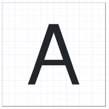
Now that I've had a look at the icon, it's not aligned with the pixel grid. The original icon wasn't very well aligned either, but at least the top and bottom were. Shrinking down from one monochrome size to another without adjusting to fit the grid generally doesn't work very well.

Have a look at format-font-size-more
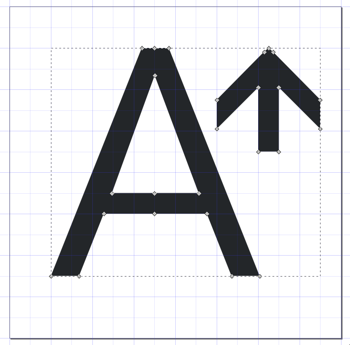
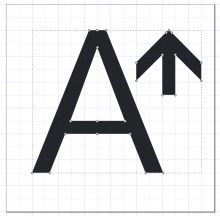
You only need to copy the A. You can do that by breaking apart the path (Path->Break Apart, Ctrl+Shift+k), then using Path->Difference (Ctrl+-) with the triangle in the middle of the A and the A itself selected to get the triangular hole back.
To be honest, the original icon isn't that great, but I don't have any better ideas and I won't blame you for not wanting to come up with something brand new.
This comment was removed by rooty.
Comment Actions
Is this ok? I had to stretch it out a lil bit at the top and bottom

In my previous comment I just moved it and I realized it had four pixels above and three below it...
Comment Actions
@rooty just copy a different 16px font icon like gtk-select-font and remove the other things than the A and align it in the horizontal center.