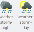
Current icons are a bit too visually busy and cluttered. This patch corrects that by removing the background cloud and slightly resizing and repositioning the sun and moon.
BUG: 403830
FIXED-IN: 5.55
| kossebau | |
| ndavis |
| VDG |
Current icons are a bit too visually busy and cluttered. This patch corrects that by removing the background cloud and slightly resizing and repositioning the sun and moon.
BUG: 403830
FIXED-IN: 5.55
Before:
| Automatic diff as part of commit; lint not applicable. |
| Automatic diff as part of commit; unit tests not applicable. |
This patch corrects that by removing the background cloud
Thanks for the proposal. Hm, removal of the second cloud not what I would have expected to be done, was actually fine with it. Not sure.
slightly resizing and repositioning the sun and moon.
The current icons with sun/moon & cloud have the same size & position of the sun/moon. Changing that just for these 2 icons makes the icon set a bit more inconsistent, so if asked I would like that change to be done for all or not. Actually I am already a bit unhappy about the cloudless icons having a bigger sun/moon, that looks strange e.g. in the forecast to me.
Certainly an improvement, you just need to strip out all of the unnecessary Inkscape metadata. You can do that with, SVG Cleaner, SVGO, or go to "File->Save As" and save as a "Plain SVG". Using an SVG optimizer is preferable because it saves a tangible amount of space when other icons are also optimized.