Add a popup search bar to the plasma-nm applet
ClosedPublic

Authored by vpilo on Jan 29 2019, 9:46 PM.

Details

Summary

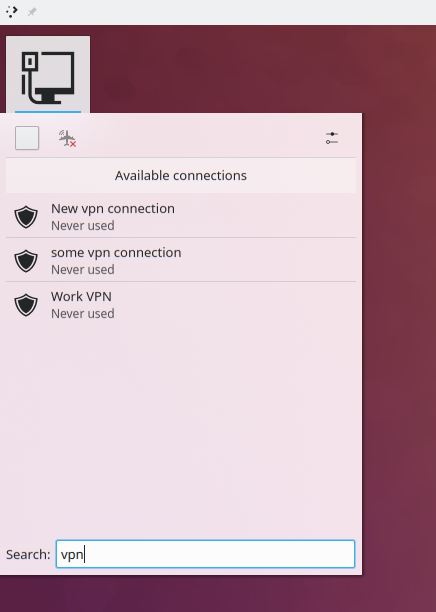
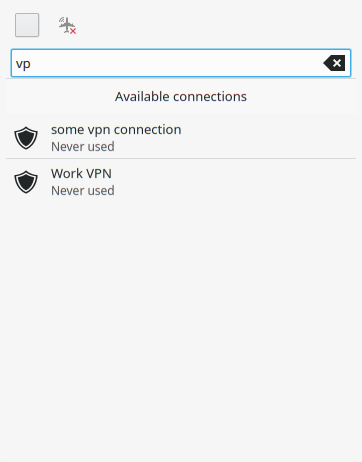
If there are not enough connections to fill the scrollview, the search bar is not displayed by default.
If there are, the search bar is shown.
Regardless of that, starting typing will filter the connections list and show the search bar.

I'm uncertain whether not hiding it by default would be a good idea, usability wise.

BUG: 344789
BUG: 394290

Diff Detail

Repository
R116 Plasma Network Management Applet
Branch
vpilo/searchBar (branched from master)
Lint
No Linters Available
Unit
No Unit Test Coverage
Build Status
Buildable 7704
Build 7722: arc lint + arc unit
vpilo created this revision.Jan 29 2019, 9:46 PM
Restricted Application added a project: Plasma. · View Herald TranscriptJan 29 2019, 9:46 PM
Restricted Application added a subscriber: plasma-devel. · View Herald Transcript
vpilo requested review of this revision.Jan 29 2019, 9:46 PM

Seems niche, but this solution is also unobtrusive, so I like that. I have a lot of VPNs searching through them would be quite useful.

Having the search bar on the bottom is a bit weird as when you filter the results will be at the top, meaning the user's focus is split all over the place.

applet/contents/ui/PopupDialog.qml
98

The connection view changes height depending on the presence of a search bar
The search bar becomes visible depending on the height of the listview

I would expect that to be giving binding loops when you're on the edge.

libs/models/appletproxymodel.cpp
60

what happens if you have a filter and the the entry is a slave?

libs/models/appletproxymodel.cpp
60

Edit: ignore this.

Better just place it at the top above the the connections list, then?

Better just place it at the top above the the connections list, then?

I think that would make sense.

In such a limited space, I think it's fine for the search field to only appear if the list would otherwise be scrollable.

Wouldn't be a small search bar placed next to the aiplane mode enough? That way it will not need additional vertical space. Hiding it when there is only a small amount of connections is a good idea.

PS: Please add me as a reviewer next time for plasma-nm changes.

Wouldn't be a small search bar placed next to the aiplane mode enough? That way it will not need additional vertical space. Hiding it when there is only a small amount of connections is a good idea.

Isn't there way too little space for it inside of the toolbar?


It would need at least 150-200 px, and that's exactly how much I have in that screenshot. In my panel nm applet, there's just a tiny bit more space (~50px). How could I visually separate it from the other buttons around it?

PS: Please add me as a reviewer next time for plasma-nm changes.

Sure. Is this kind of info written anywhere?

Wouldn't be a small search bar placed next to the aiplane mode enough? That way it will not need additional vertical space. Hiding it when there is only a small amount of connections is a good idea.

Isn't there way too little space for it inside of the toolbar?

Hmm, it probably is, it's not in my case but that depends on screen size and resolution. I wouldn't definitely put it at the bottom. To be honest, I wouldn't add this at all, because the applet is really small. What I would prefer is to add some sort of sorting based on connection priority, that way you can have relevant connections at the top and you will not need to search for them.

It would need at least 150-200 px, and that's exactly how much I have in that screenshot. In my panel nm applet, there's just a tiny bit more space (~50px). How could I visually separate it from the other buttons around it?

PS: Please add me as a reviewer next time for plasma-nm changes.

Sure. Is this kind of info written anywhere?

I guess it's not, maybe this can be configured in Phabricator somehow, no idea, I just don't want to miss any plasma-nm review as its maintainer.

I guess it's not, maybe this can be configured in Phabricator somehow, no idea, I just don't want to miss any plasma-nm review as its maintainer.

This is something that Phabricator can do automatically, if it's configured. I've asked Sysadmin to do so: {T10420}

Putting the search bar in the toolbar on top is an interesting idea. There's definitely room on mine. However it does start to feel a bit cramped. +1 for the idea of a search field though.

I guess it's not, maybe this can be configured in Phabricator somehow, no idea, I just don't want to miss any plasma-nm review as its maintainer.

This is something that Phabricator can do automatically, if it's configured. I've asked Sysadmin to do so: {T10420}

Great!! Thank you for that.

Putting the search bar in the toolbar on top is an interesting idea. There's definitely room on mine. However it does start to feel a bit cramped. +1 for the idea of a search field though.

My opinion is: I don't want the search bar to take any additional vertical space by default, not even when there is many connections, because I don't need usually to scroll down to find the connection I need. On the other hand I get it might be useful for someone else. What about showing the search bar once users start typing?

Putting the search bar in the toolbar on top is an interesting idea. There's definitely room on mine. However it does start to feel a bit cramped. +1 for the idea of a search field though.

Alternatively we can show a small input box just saying "Search ..." and clicking into it to start typing it would hide all the switches in the toolbar (wifi, wwan, airplane) and expand across the whole toolbar?

Alternatively we can show a small input box just saying "Search ..." and clicking into it to start typing it would hide all the switches in the toolbar (wifi, wwan, airplane) and expand across the whole toolbar?

That's not a bad idea! And then when the user clicks on the "clear text" on the right side of the search field, it would collapse to its prior size.

vpilo added a comment.Jan 30 2019, 5:32 PM

Here's my latest change, not submitted yet.

The differences are that I moved the bar to the top, made the label into a placeholder text, and added a bit of margin on the textfield sides.

Putting the search bar in the toolbar on top is an interesting idea. There's definitely room on mine. However it does start to feel a bit cramped. +1 for the idea of a search field though.

My opinion is: I don't want the search bar to take any additional vertical space by default, not even when there is many connections, because I don't need usually to scroll down to find the connection I need. On the other hand I get it might be useful for someone else. What about showing the search bar once users start typing?

If you usually don't need to scroll down to find a connection you need, then you won't see the search bar.

As you can see:

  • When the list of connections is short:
    • If the user starts typing, then it shows automatically.
    • When the field is emptied, then it hides.
  • When the list of connections is long enough to already need a scrollbar:
    • The field is always shown, and highlighted.
    • You just lose one entry of vertical space that you have to scroll through anyway.

Alternatively we can show a small input box just saying "Search ..." and clicking into it to start typing it would hide all the switches in the toolbar (wifi, wwan, airplane) and expand across the whole toolbar?

That's not a bad idea! And then when the user clicks on the "clear text" on the right side of the search field, it would collapse to its prior size.

I think my approach is less visually obtrusive, and you can still use everything else in the widget while the search field is active.

BTW regardless of where we put the search field, its placeholder text should just be Search....

vpilo updated this revision to Diff 50567.Jan 30 2019, 5:43 PM
  • review

Up, not down
No label
Changed search label

vpilo added inline comments.Jan 30 2019, 5:46 PM
applet/contents/ui/PopupDialog.qml
98

How would I test this?

With this approach I will basically see it all the time, you can have just one connection hidden and the search bar will pop up, I don't want that and in my opinion it doesn't look good. Either should be placed in the toolbar or visible only when you start typing.

only when you start typing.

Not a great idea since there's no way to know you can search if you start typing; it would be an invisible UI and nobody would ever find it. Even in GNOME where they have this paradigm everywhere, people hate it because it's not discoverable when you want it, and annoying when you accidentally activate it.

I liked your idea of putting a stub in the toolbar that expands to the full width when clicked in.

Besides, it doesn't seem to work as it should:

  1. It removed the button in the top right corner which opens the KCM
  2. When I restart plasmashell, the search bar is visible even when I have only 4 connections (no scrollbar), typing some text and clearing it makes it disappear correctly

Can you look into placing the search bar into the toolbar? Perhaps making it visible also only when there are many connections and when it makes sense to search for them. I tried to place it there and it looks ugly when you use PlasmaComponents.TextField, maybe just some text field without frame and borders should be used.

vpilo updated this revision to Diff 50582.Jan 30 2019, 11:25 PM
  • New implementation with a toolbutton
    • Also added search reset on Esc keypress, on applet close, on search close

I made a few tests and with all 3 toolbuttons (wifi/mobile/airplane) in place, also adding the search bar to the toolbar itself makes it cramped and you can't type a lot in it.
This version IMHO looks neater and I think still pretty unobtrusive, while still making the feature discoverable by having a button.

vpilo marked an inline comment as done.Jan 30 2019, 11:27 PM
vpilo added inline comments.
applet/contents/ui/PopupDialog.qml
46–48

This is to solve layouting issues when toggling the search bar.

+1, I actually like it now with the search button. I will try it properly later and go through your code.

abetts added a subscriber: abetts.Jan 31 2019, 6:31 AM

Does the hug allow for just a search button and a non-always visible search field?

Does the hug allow for just a search button and a non-always visible search field?

Yep, I want to have it visible only when a user opens it manually, it shouldn't be visible by default when the list of connections is long and there is a scrollbar visible.

jgrulich accepted this revision.Jan 31 2019, 7:02 AM

Looks good to me and also seems to work properly.

Wait for @ngraham if he agrees with this, but I think it's okay in this form and it will not bother people by forcing them a search bar when they don't need it.

This revision is now accepted and ready to land.Jan 31 2019, 7:02 AM
ngraham accepted this revision.Jan 31 2019, 10:44 PM

Yep, I think this is fine. Shipit!

This revision was automatically updated to reflect the committed changes.