[Folder View] improve label contrast against challenging backgrounds
ClosedPublic

Authored by ngraham on Nov 18 2018, 5:42 AM.

Details

Summary

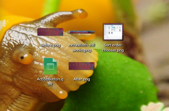
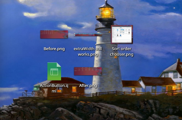
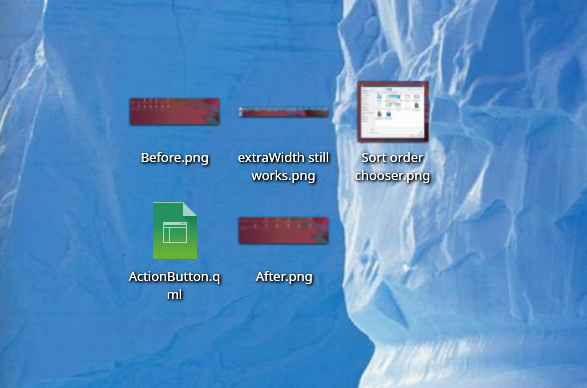
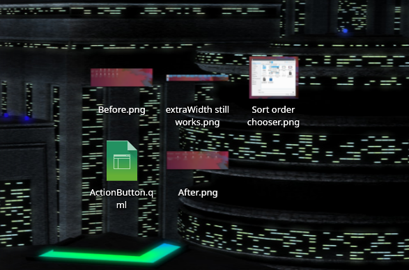
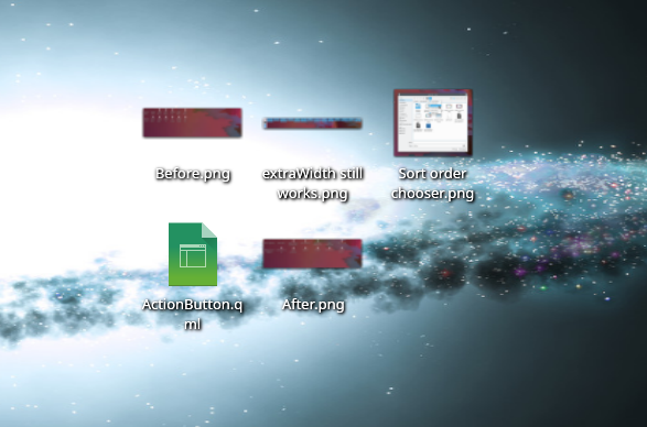
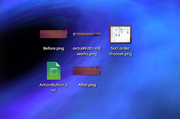
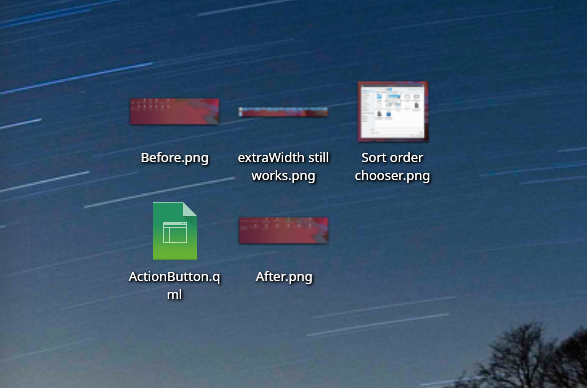
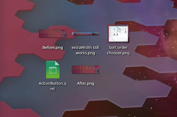
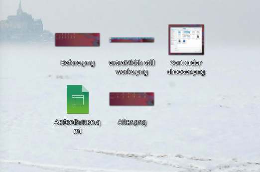
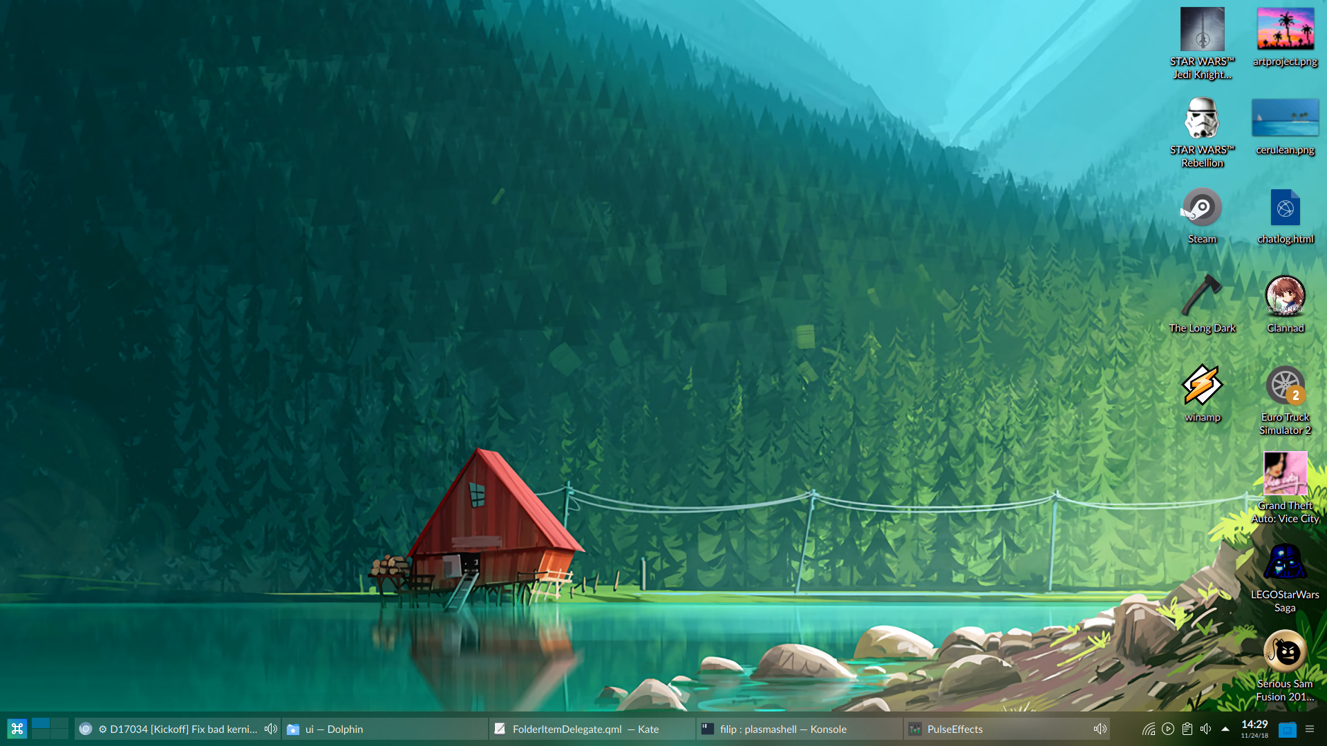
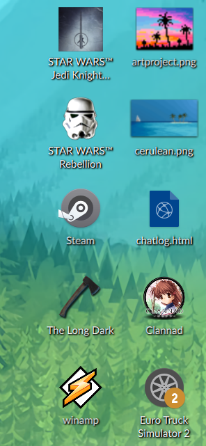
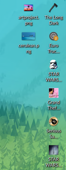
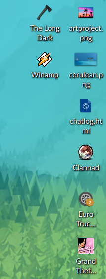
Currently the shadow behind Folder View items' labels is very subtle. This leads to poor contrast against wallpapers that are light-colored, visually busy, or both.

This patch attempts to improve the situation by tightening up the shadow so that it looks more like a subtle, tasteful outline.

BUG: 361228
FIXED-IN: 5.12.8

Test Plan

Folder View items against various wallpapers:

Folder View items against the default wallpaper:

Diff Detail

Repository
R119 Plasma Desktop
Lint
Automatic diff as part of commit; lint not applicable.
Unit
Automatic diff as part of commit; unit tests not applicable.
ngraham created this revision.Nov 18 2018, 5:42 AM
Restricted Application added a project: Plasma. · View Herald TranscriptNov 18 2018, 5:42 AM
Restricted Application added a subscriber: plasma-devel. · View Herald Transcript
ngraham requested review of this revision.Nov 18 2018, 5:42 AM
ngraham edited the test plan for this revision. (Show Details)Nov 18 2018, 5:43 AM
hein added a comment.Nov 18 2018, 8:11 AM

Looks ugly to me. Honestly, my stance is "use a better wallpaper". There's only so far you can compromise theme aesthetics for other people's bad taste.

I can understand that.

However, I think it's kind of a foul to change the UI such that the label becomes difficult to read with a lot of wallpapers, and then say, "just choose a better wallpaper." This isn't very respectful of our users, who I think should be free to put whatever they want on their desktops without it making their desktop icon labels illegible.

Open to suggestions.

mart added a subscriber: mart.Nov 23 2018, 12:34 PM

tough now it looks a bit too much like a blur around the letters, rather than a shadow

The classical solution to these problems is always a white text with black outline. Works well for both light and dark backgrounds.

Some image from the internet: https://i.imgur.com/pQjoQ.png

That's a great point. In fact, now that I'm looking for it, I see that Windows uses a black outline on the white label text for their desktop icons.

Unfortunately, the QML outline effect doesn't seem to look real good, at least not with the very small default font size used for the label:

Not sure that'll work.

ngraham updated this revision to Diff 46099.Nov 24 2018, 5:17 AM

Make the effect a bit more subtle

ngraham edited the test plan for this revision. (Show Details)Nov 24 2018, 5:18 AM
filipf added a subscriber: filipf.EditedNov 24 2018, 11:00 AM

The icon labels should be visible enough with pretty much any wallpaper used. Historically in other systems there's been some cheating involved by having default wallpapers deliberately be darker on the left side, but you'd think we could come up with something better over the years :)

Windows always did this right in the post XP era. I just went to check how they do it and it's not an outline. They have a drop shadow horizontally offset to the right and vertically offset to the bottom, but both not but by much actually. What makes it work is the strength of the shadow. It's pretty dark and not too blurred/smudged. They don't have a problem with this:

In D16968#364753, @mart wrote:

tough now it looks a bit too much like a blur around the letters, rather than a shadow

If it's possible to mimic their solution with QML, the end result could work well.

EDIT: it can look like an outline because it's so closely positioned

Here's my rough estimation of what Windows does, although maybe a bit more subtly:

horizontalOffset: 1
verticalOffset: 1

radius: 4
samples: 9
spread: 0.5

Before:

After:

After (with fixed kerning):

There's a small problem, however. Compare e.g. the sharpness of the "winamp" label with "Star Wars Rebellion" label. Winamp got a bit blurry for some reason.

Ultimately if the blurriness can be resolved I'd recommend:

horizontalOffset: 1
verticalOffset: 1

radius: 3
samples: 7
spread: 0.3

Before:


After:

After (in a darker environment):

Hey, that looks pretty darn good!

I'll tweak the values a bit (just a bit) from what you suggested and rejigger this patch to use them.

ngraham updated this revision to Diff 46123.Nov 24 2018, 2:50 PM

Use a much tighter shadow that kind of looks like a tasteful outline

ngraham edited the test plan for this revision. (Show Details)Nov 24 2018, 2:52 PM
ngraham edited the summary of this revision. (Show Details)

Looks great to me with your values! The shadows don't draw much attention and the labels are finally not wimpy looking in certain situations.

Thanks! I like this too. Let's see if VDG and/or Plasma folks agree. :)

Much better now! +1

ngraham edited the summary of this revision. (Show Details)Nov 24 2018, 5:31 PM

Looks great! Not having to avoid certain wallpapers is a big win for usability. :)

filipf added a comment.EditedNov 24 2018, 6:39 PM

I've been testing this solution some more and I think I'm running into either a QML (using Qt 5.11.2) or widget bug, can someone else test to make sure it's not just my setup?

Basically the text and the shadows can look hazy and unsharpened at times. The easiest way to reproduce this seems to be by changing icon sizes, e.g. from Large to Small Medium:

Then to trigger proper rendering, I can simply sort the icons differently:

EDIT: This has nothing to do with new values; it happens with the old ones as well.

filipf added a comment.EditedNov 24 2018, 7:01 PM

^ Sorry to digress, but an update: bug does not happen if icons are in rows at the top (when the panel is at the bottom). We probably have bug with how the folder view widget adjusts the dimensions of its elements when it encounters panels or some other elements it has to adjust itself to.

EDIT: reported this https://bugs.kde.org/show_bug.cgi?id=401374

Can't reproduce with Neon dev unstable / everything from git master. Then again I don't really see the problem in those screenshot in the first place.

Ah never mind, I see it now.

Still, that's not connected to this patch, so let's try to keep the conversation on-topic. :)

abetts added a subscriber: abetts.Nov 24 2018, 9:31 PM

Looking good guys! +1

hein accepted this revision.Nov 27 2018, 2:06 PM
This revision is now accepted and ready to land.Nov 27 2018, 2:06 PM
This revision was automatically updated to reflect the committed changes.