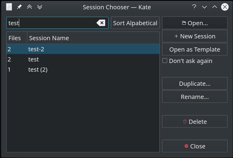
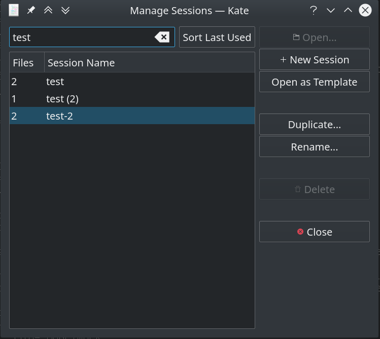
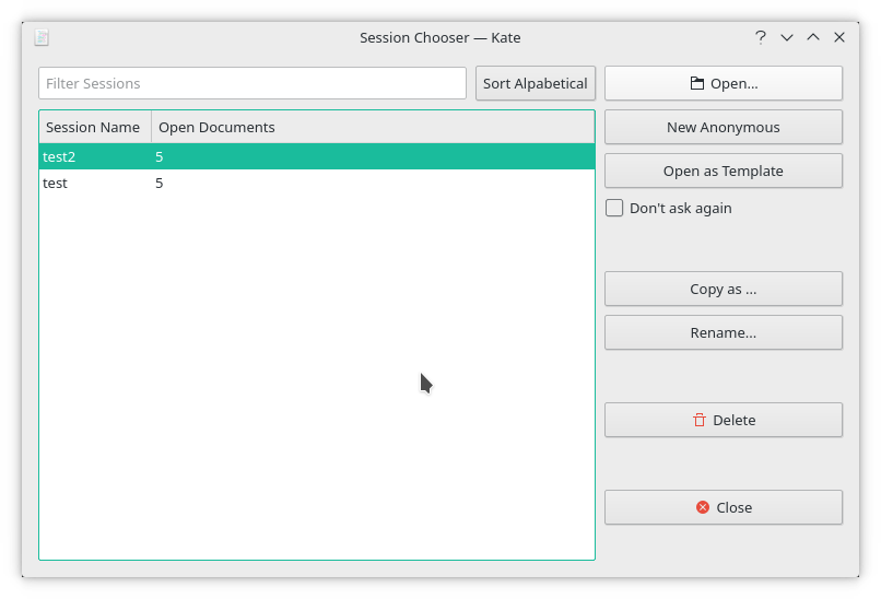
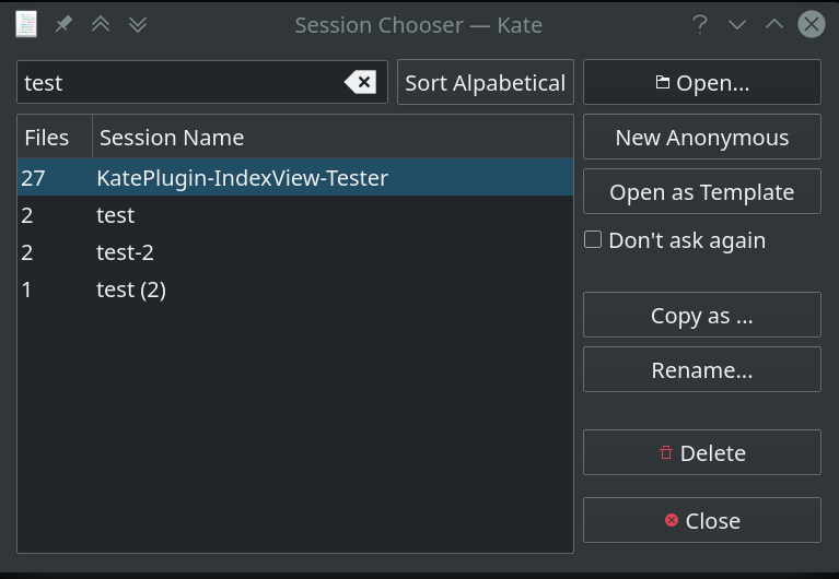
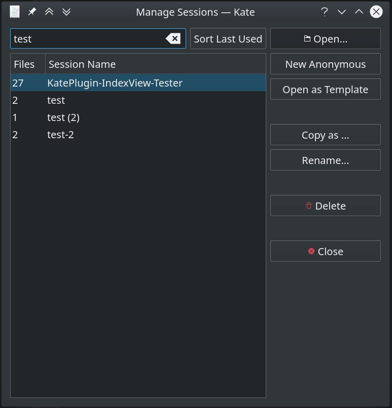
Review user interaction in session management
ClosedPublic

Authored by loh.tar on Nov 16 2018, 4:20 PM.

Details

Summary
  • SessionManageDialog
    • Build user interface by ui file
    • Avoid obsolete Qt members
    • Choose more meaningful member names
    • Add filter field and sort button
    • Open session by double click
    • Add buttons for "Copy" and "Open as Template"
    • Reorder a couple of code to be a little bit more logic ordered
    • Delete a session with delay which offer a restore and avoid annoying confirmation dialog
    • Rename a session inside of the list view to avoid extra popup window to enter the new name.
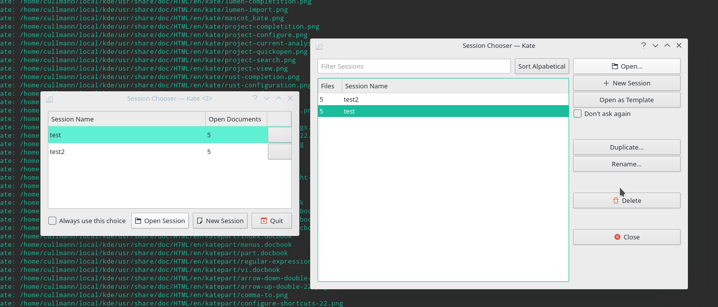
  • Remove SessionOpenDialog, use SessionManageDialog instead
  • Remove SessionChooser, use SessionManageDialog instead
  • SessionManager
    • Add signal sessionListChanged() To avoid unneded signals is updateSessionList() slightly modified with a clearer look and an added check for changes in an easy way.
    • Add copySession()
    • Let rename/copySession() ask for a new name when needed
    • Move session creation parts from newSessionName() to sessionSaveAs()
    • Rename newSessionName() to askForNewSessionName()
    • Add suggestNewSessionName()
    • Don't create anonymous session in ctor
    • Don't save anonymous session as last session
  • MainWindow
    • Remove from sessions menu "Open Session" because it's now the same as "Manage Sessions"
Test Plan


Diff Detail

Repository
R40 Kate
Lint
Lint Skipped
Unit
Unit Tests Skipped
loh.tar created this revision.Nov 16 2018, 4:20 PM
Restricted Application added a subscriber: kwrite-devel. · View Herald TranscriptNov 16 2018, 4:20 PM
loh.tar requested review of this revision.Nov 16 2018, 4:20 PM

Because this a little extensive patch, I guess you will need (and should take) some time for a review.

  • Split to smaller chunks is sadly in most cases problematic, please try not ask for it
  • The delete behavior may look a little unusual but I hope you will give it a chance
  • Take a closer look at "Open as Template". You may say it break your default settings when you start an anonymous session the next time. But I think that's not too bad. These default settings was for me always a little cloudy. You need some experience to handle these. So the work around for this is: Give your preferred default settings a session name, like a backup. But perhaps did I something wrong and it can be avoided to overwrite the anonymous session

Hi,

I will give that patch some try locally ;=)

For the question:

// Q:Is that the right way to protect for not available dbus? See main.cpp
520 ​#ifndef USE_QT_SINGLE_APP

I think it is enough to check if

QDBusConnectionInterface *i = QDBusConnection::sessionBus().interface();

is null, like done, not sure if the define check is needed at all. (as we still link against qdbus, just not want to rely on it working)

loh.tar updated this revision to Diff 45708.Nov 18 2018, 5:54 AM

Oops! - Fix to give anonymous session a name

  • Avoid own entry in window/task-manager

You should increase version to 84 https://phabricator.kde.org/source/kate/browse/master/kate/data/kateui.rc$3 Also you can generate diffs like git diff -U9999 > file for context to present.

loh.tar updated this revision to Diff 45709.Nov 18 2018, 8:54 AM
  • Remove preprocessor protection of QDBus availability
  • Increase kpartgui version to 84

Done. BTW I had tried to change the order of the menu entries, without success (?)

Also you can generate diffs like git diff -U9999 > file for context to present.

Um, really 9999? I have used now 9

Done. BTW I had tried to change the order of the menu entries, without success (?)

~/.local/share/kxmlgui5/kate/kateui.rc

Um, really 9999? I have used now 9

It just use big enough number to not have "Context not available."

~/.local/share/kxmlgui5/kate/kateui.rc

Thanks!

Um, really 9999? I have used now 9

It just use big enough number to not have "Context not available."

I never recognized that. After some recent patch uploads I must say it's a little difficult/annoying. So, 9999 may a always working solution but looks a little strange to upload always the whole file.

Hi, perhaps you should try https://community.kde.org/Infrastructure/Phabricator#Using_Arcanist_to_post_patches to post patches.

It actually makes this much easier, I use it to land your patches, too.

It might be a bit of a hassle first, but it automates some things nicely.

I would like to avoid these Arcanist. But every hint what I have to be aware of is much apricated.

I have no idea what is the issue with these "No context" hint, but got the feeling it is caused when the begin of the function is missing. But when I now look at that here I have again doubts. Furthermore must I take care to add enough reviewer and subscribers.

Please give me exact points what's wrong with my posts and what I have to change.

PS: Um, Lint/Unit test skipped is very bad and related to the context issue?

As I yielded and used arcanist, I can't really help with how to best manually handle patches here.

But methods aside, I have taken a look at the changes ;=)

Actually, I like the new UI a lot!

The only thing I would alter on the dialog is to align the "close" button to the lower edge of the dialog with some spacer, otherwise I think the new dialog is a big enhancement compared to the old.

For the session list: Perhaps it might make sense to move the "Open Documents" column to the left, as that one is normally "fixed width" and the name after it.

One could even shorten the header to just "Documents".

Perhaps others have input, too.

Dominik, can you give it a try?

loh.tar updated this revision to Diff 46175.Nov 25 2018, 6:49 AM

Glad to read that :-)

  • I have grouped the buttons by functionality, and always dislike designs where dangerous functionality is near placed by often used one. So my biggest objection here are the similar looking Delete and Close buttons. That's why are separated by a spacer. But I understand that there are also "Design-Rules" exist to place always the same function in the same order at the same place. Now with the ui-file design can that relatively easy changed. Perhaps after a first "field test"?
  • Your screenshot looks indeed not so nice with the big Document column and the small Session one. Updated as suggested and renamed to a shorter text. How about to remove (hide) the Document/Files column? They show by the way not the correct count when you open/closed some in the meantime. I have an additionally patch here which try to solve this but looks to me a little overkill, but perhaps you like it.

I like the switched files/name column variant.
I have no issues with grouping the button by kind.
Perhaps others have some input, too, otherwise I would like to accept these changes.
Nate or Dominik, perhaps some input? You are more versed in UI stuff than me :P

ngraham requested changes to this revision.Nov 26 2018, 4:29 AM
ngraham added a reviewer: VDG.

When submitting patches that change the UI, please add VDG as a reviewer and put screenshots in the Test Plan section rather than in a comment, where they will get buried :)

Here are a few things that jump out at me:

  • The Sort Alphabetical button should be a combobox with the different sorting options
  • It's not clear what the New Anonymous and Open as Template buttons do, or the Don't ask again checkbox. What's being asked?
  • "Copy As..." would be better worded as "Duplicate..."
  • The Close button should probably be renamed "Select" or "Choose" so it's clear that the selected session will be made the active one
  • The bottom-most button should be aligned to the bottom of the list box, as @cullmann suggested
This revision now requires changes to proceed.Nov 26 2018, 4:30 AM
anthonyfieroni added inline comments.Nov 26 2018, 5:14 AM
kate/session/katesessionmanagedialog.cpp
68–69 ↗(On Diff #46175)

Especially this comments should go away.

118 ↗(On Diff #46175)

Debug messages also go out. It's kind of info before you ship it.

496–499 ↗(On Diff #46175)

Also don't commit commented code.

@ngraham Thanks for the VDG/screenshot advice, will hopefully remember that the next time :-)

The bottom-most button should be aligned to the bottom of the list box, as @cullmann suggested

Oh, I misread that, sorry. Somehow was "Open button" in my mind, that's because my answer about grouping.

The space(r) is there to avoid unneeded "Mouse-Meters" :-) Consider any default dialog where the horizontal buttons also placed at one side (usually right) and not at opposite ends. Here they are vertical at the top.

The Close button should probably be renamed "Select" or "Choose" so it's clear that the selected session will be made the active one

The Close button close the dialog, like Abort. If you mean to rename "Open" I can do it. But IIRC was the old dialog buttons named the way as they are currently.

"Copy As..." would be better worded as "Duplicate..."

Can do it, but "Copy As..." is something I have often seen, "Duplicate..." on the other hand (?)

The Sort Alphabetical button should be a combobox with the different sorting options

That would be less handy, and unneeded annoying. Do you notice that the caption will changed when you click on it?

the Don't ask again checkbox. What's being asked?

It's borrowed from the removed (old) KateSessionChooser dialog and only shown in "Chooser Mode". Guess it was there named "Always use this choice" but that text was too long and would break the nice layout. I didn't find a better place for that. How about at tool tip text as hint?

It's not clear what the New Anonymous ... do

Old naming was "New Session"

and Open as Template buttons do

Keep all settings, but don't open documents, as new anonymous session. See also D16926#360472

@anthonyfieroni Will do it.

But let me explain that I always keep such a like comments there to show you guys that my shipped solution is the result from a couple of considerations. Sometimes to avoid unneeded questions, sometimes to request suggestions for better solutions, sometimes to inform you that there could be something generally improved. In the latter case with the hope you say, "No, because.." or "Yes, would be great, (will trigger some guy | please do it)"


Would be nice to get some more opinions, and clear advice how to fix some of these obscurities, if really needed.

Additionally shot of the unfixed dialog in "Manager Mode". Notice the different window title, order of entries (hard to find, sorry), caption of the sort button, gone check box and how the buttons are placed when the window has more height.

The Close button close the dialog, like Abort. If you mean to rename "Open" I can do it. But IIRC was the old dialog buttons named the way as they are currently.

Then the close button is not necessary at all; the window always has its own close button.

"Copy As..." would be better worded as "Duplicate..."

Can do it, but "Copy As..." is something I have often seen, "Duplicate..." on the other hand (?)

To me, "Duplicate..." sounds more natural, and I don't think I've seen "Copy As..." in English in very many user interfaces.

The Sort Alphabetical button should be a combobox with the different sorting options

That would be less handy, and unneeded annoying. Do you notice that the caption will changed when you click on it?

That's a bad UI, sorry. Buttons shouldn't change their text like that. The combobox was invented for exactly this use case. :)

the Don't ask again checkbox. What's being asked?

It's borrowed from the removed (old) KateSessionChooser dialog and only shown in "Chooser Mode". Guess it was there named "Always use this choice" but that text was too long and would break the nice layout. I didn't find a better place for that. How about at tool tip text as hint?

Not sure I'm familiar enough with how any of this functionality actually works. I'll defer to the Kate folks here.

It's not clear what the New Anonymous ... do

Old naming was "New Session"

"New Session" seems better to me. It should have the list-add icon.

and Open as Template buttons do

Keep all settings, but don't open documents, as new anonymous session. See also D16926#360472

I still have no idea what this means. :)

To me, "Duplicate..." sounds more natural, and I don't think I've seen "Copy As..." in English in very many user interfaces.

Well, probably my fault, due to "Save as" :-) Guess "Copy..." is also not your taste.

Then the close button is not necessary at all; the window always has its own close button.

Yes it has. But a "Close" button is usually there (?). If really no one want to see it here, OK, can remove it

That's a bad UI, sorry.

So far it's only your opinion. @cullmann "like it a lot."

"New Session" seems better to me. It should have the list-add icon.

Thanks, will do it

The "the Don't ask again checkbox. What's being asked?" thing:

This dialog is used on Kate startup, too, in the "chooser mode".
If you check that, Kate will silently use the last choice for all future startups and no longer show the chooser.

I think the new dialog is a big improvement over the old. Still one should take the additional input into consideration ;=)

For the sorting "checkbox/combobox": Perhaps it would be easier to just remove that and have the last used date as column to click on, if one wants to sort it that way?
That would provide more info, too, like "oh, that isn't used since XX months".

Still one should take the additional input into consideration ;=)

I do. But requests which will be a deterioration are not loved be me from the start. He says nothing to convince me, He only state, "No where is that done this way". I have doubts. But if so, who cares? That's the way how progress works. Some "crazy guy" do something differend.

Perhaps it would be easier to just remove that and have the last used date as column to click on

This suggestion is not bad. Unfortunately may that require some bigger changes.

loh.tar updated this revision to Diff 46315.Nov 27 2018, 2:36 PM
loh.tar edited the test plan for this revision. (Show Details)
  • Remove comments as requested
  • Change Button text and icons as requested
  • Avoid gab of Close button to the bottom when window is smaller

Here is a compare old vs. new.

(for the chooser you get when opening kate and session choosing is activated)

I think the new dialog is already nicer (yes, the grey blobs in the dialog on the left are buttons with a menu :/ that contain duplicate/delete)

I would say we can do this in a few iterations.

If nobody strongly objects, I would apply the current patch and we can have more improvements, like the sorting via table headers instead of the button in a new patch.

Would that be fine?

The Close button should probably be renamed "Select" or "Choose" so it's clear that the selected session will be made the active one

The Close button close the dialog, like Abort. If you mean to rename "Open" I can do it. But IIRC was the old dialog buttons named the way as they are currently.

I would be in favor off renaming the "Open ..." button to "Select", "Choose" or "Open Session" like it used to be. "Open ..." is kind of a well known button, where the user expects a file picker to open up, and since "Open ..." does not require any additional user actions the ellipsis is against HIG the https://hig.kde.org/style/writing/labels.html .

the Don't ask again checkbox. What's being asked?

It's borrowed from the removed (old) KateSessionChooser dialog and only shown in "Chooser Mode". Guess it was there named "Always use this choice" but that text was too long and would break the nice layout. I didn't find a better place for that. How about at tool tip text as hint?

To me, in the old layout this was much clearer. The checkbox to the left of buttons to remember an action is a pattern that is used commonly in KDE, but I have not seen it below some buttons.

If you don't expect users to have a high number of sessions, maybe replacing the "Duplicate...", "Rename..." and "Delete ..." button with three icons in each row? That way a user has to only click once, instead of clicking twice (select row + button), you would get rid of the three buttons and the interaction pattern is probably easier to understand for the user. It is very obvious on which session the action is executed.

Disadvantage; if you have a lot of sessions, the icons might clutter the interface and while the trash can and the edit icon is probably obvious to anybody, the icon for "Duplicate ..." might not.

we can have more improvements...in a new patch.

Needless to say, I am very much in favor of it. Although I believe that there is little room for improvement :-)

The only thing is these "Don't ask again checkbox". Here I recommend to get rid of it. Didn't investigate what's the default setting is, but when the default is to start what ever session, aka not to show the Chooser dialog, can the the user enable it in the config page. Sure, he should remember that someone later how to change that. But that's the case for many other settings too.

With any further changes (except tiny cosmetics) I may give my unpopular comments but didn't like to code it.

Have other people more feedback for this?

dhaumann accepted this revision.Dec 8 2018, 4:09 PM

I agree this should go in (possibly with minor improvements I added as comments): The patch is already big enough, so I'd rather prefer continuation work on followup patches.

Improvements I could imagine:

  • Rename "Open..." to "Open Session" without trailing '...'
  • Add column "Last Used" in the list view
  • Remove the Sort button in favor of making the columns clickable to sort the respective column
  • File open dialogs usually have a small 'config' button, so if we keep the Sort button, I would prefer to have a drop down menu that allows not only "Sort alphabeticaly" but also "Sort chronological" or similar.

Please push this only to master and not the Applications 18.12 branch. This way, we have 4 months of testing.

kate/session/katesessionmanagedialog.h
203

I would prefer using the enum SortOrder here as type instead of an int. In fact, I would even be in favor of an enum class SortOrder { Alphabetical, Chronological };

cullmann accepted this revision.Dec 8 2018, 5:23 PM

I will push this change now, as is, I would appreciate further patches that improve up on this.

Alone the c++ => ui conversion is already a big win.

Thanks for the effort!

This revision was not accepted when it landed; it landed in state Needs Review.Dec 8 2018, 5:27 PM
This revision was automatically updated to reflect the committed changes.

Hmpf, my fixing up of the kateui version killed my author settings :/

But the changes should be in now.

https://cgit.kde.org/kate.git/commit/?id=e078ee324ff6677767640b9fdd47d612cd734ab4