Adjust spacing in crop UI
ClosedPublic

Authored by rkflx on Aug 17 2018, 7:03 PM.

Details

Summary

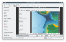
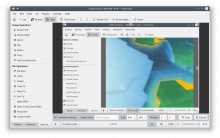
Currently the multitude of labels and spinboxes in the advanced
Crop bar looks quite cluttered.

By adjusting the horizontal spacing we can group corresponding elements.
This makes the interface slightly faster to navigate and clears up any
ambiguity regarding which labels belong to which spinboxes.

While the minimum horizontal window size while opening the advanced
options will get slightly wider, everything should still fit on a
typical display.
Test Plan

CropAdvanced Settings works as before, looks better. Spacing
still works fine with other widget styles.

Before:


After:

Diff Detail

Repository
R260 Gwenview
Lint
Automatic diff as part of commit; lint not applicable.
Unit
Automatic diff as part of commit; unit tests not applicable.
rkflx requested review of this revision.Aug 17 2018, 7:03 PM
rkflx created this revision.
muhlenpfordt accepted this revision.Aug 18 2018, 7:50 AM
muhlenpfordt added a subscriber: muhlenpfordt.

No code change and visual check looks good.
The Advanced settings bar is really wide. Should we try to split this into two lines if there is not enough space, e.g. with a floating layout?


Found a little issue with keyboard handling. If you to the Cancel button and press Return the dialog is accepted instead of canceled. The same happens in red eye tool.

This revision is now accepted and ready to land.Aug 18 2018, 7:50 AM

The Advanced settings bar is really wide. Should we try to split this into two lines if there is not enough space, e.g. with a floating layout?

Yeah, I had a similar thought initially (make Advanced Settings open a second bar), but then concluded that it is probably not a good idea to take away vertical space from everyone to allow a minority to have narrower windows.

As you said, maybe this can be done dynamically, similar to how Add Filter behaves (see FlowLayout). In order to not look weird, this would need to center horizontally though, and affect groups (ratio, size, position, buttons) instead of single UI elements.

As Gwenview's layout expert, feel free to work on it ;)


Found a little issue with keyboard handling. If you to the Cancel button and press Return the dialog is accepted instead of canceled. The same happens in red eye tool.

…and for both buttons pressing Space will do the wrong thing.

A known issue for a long time, but now that you brought it up again I had to try to solve it. Spoiler: I might have a patch…

This revision was automatically updated to reflect the committed changes.