This patch makes the Settings page visually consistent with the Updates page. Now that both have (with the Breeze color scheme) a gray background, with white list items than span the full width. Button placement is also improved, thanks to a recent Kirigami patch that automatically moves it in a bit when a scrollbar is visible.
Details
Details
- Reviewers
apol - Group Reviewers
Discover Software Store - Commits
- R134:85f6a6a0476a: Use a consistent visual style on the Settings page
Here's what the Updates page whose style we want to match currently looks like:

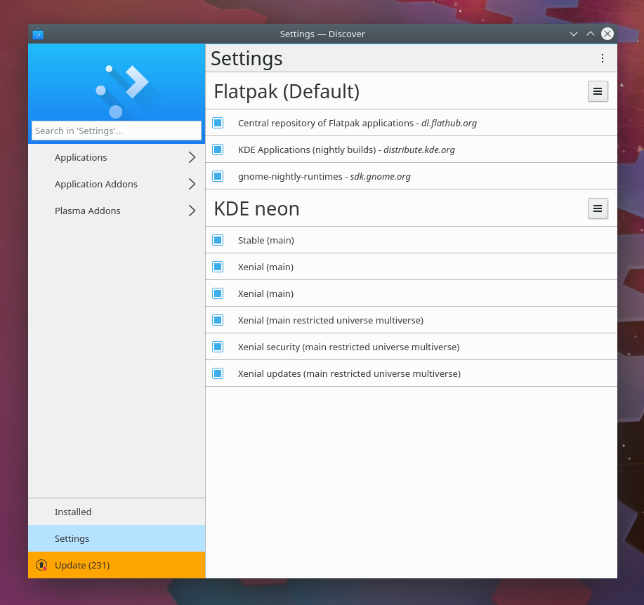
Settings page, before:
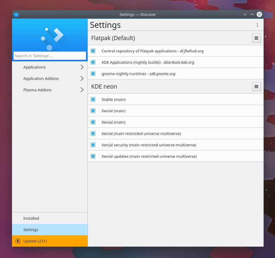
Settings page, after:
Diff Detail
Diff Detail
- Repository
- R134 Discover Software Store
- Branch
- polish-settings-page (branched from master)
- Lint
No Linters Available - Unit
No Unit Test Coverage - Build Status
Buildable 1454 Build 1472: arc lint + arc unit