When there is only one widget inside the layout, it would have double
margins. In case of the slider, the top and bottom margins are slightly
off (same as before), but at least on the left and right they now fit.
Details
Details
- Reviewers
ngraham - Group Reviewers
Plasma VDG - Commits
- R104:5b6e9767a73e: Fix layout of resolution selection
Diff Detail
Diff Detail
- Repository
- R104 KScreen
- Branch
- master
- Lint
No Linters Available - Unit
No Unit Test Coverage - Build Status
Buildable 1125 Build 1138: arc lint + arc unit


Comment Actions
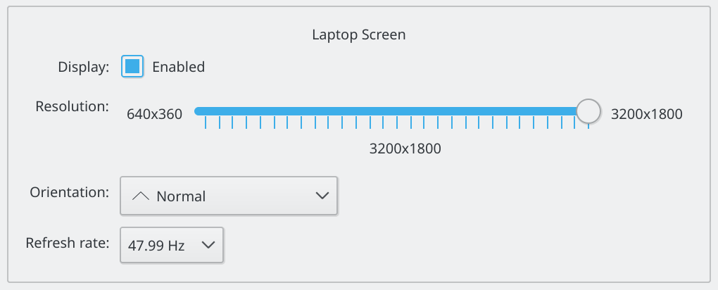
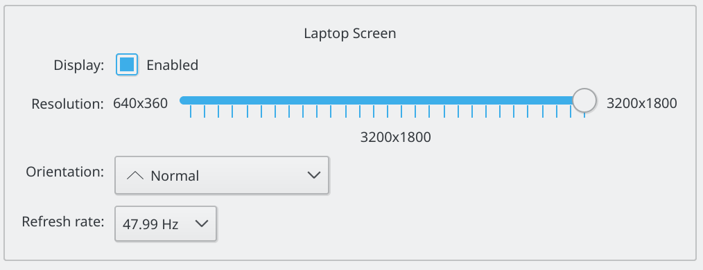
How does it look with the slider?
Off-topic: Is the slider a good idea from UX/UI perspective?
Comment Actions
The slider case after looks misaligned here now. I think you should set margins to zero only for the ComboBox case where there is only that single widget?
Comment Actions
How does it look with the slider?
There's screenshots. This patch is solely about the margins, not the fact that it uses a slider or combobox
Off-topic: Is the slider a good idea from UX/UI perspective?
That is why it uses a QComboBox if there are too many options
Comment Actions
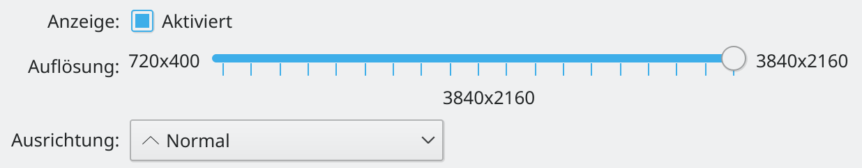
I disagree, before the 720x400 in your example would have double spacing and not be alined with the checkbox above or combo below. It also had extra space on the right for no good reason. Why should it have extra spacing?
Comment Actions
However we do it, in the above screenshot, the slider's label should be visually top-aligned so that it lines up with the resolution text on top.
Comment Actions
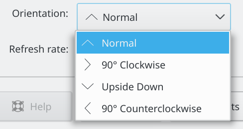
In the up arrow for the combobox that says "Normal". What is the arrow supposed to mean?
Comment Actions
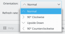
There are "arrows" used for all rotations.
(Note that that's completely unrelated to the change)
Comment Actions
I know it is unrelated. I think we may have to reevaluate those icons since they look confusing to the down arrow used by the combobox. Work for later. Thanks.
Comment Actions
The thing is that you should bring more focus to the screen factor setting. Ordinary you should not change the screen resolution you should change the factor on hidpi this should be in focus.
Nobody should change the resolution and the rate by default cause best result will always automatic setting.
Thats the reason thomas prefer the drop down from ux perspective when i say use the slider.
Comment Actions
OK, so shall we discuss the general KCM in https://phabricator.kde.org/T7254 or https://phabricator.kde.org/T4066 or https://phabricator.kde.org/T3464 ? all of them seem to be duplicates, but I don't know how to handle that.
Comment Actions
In the meantime, I'd like opinions on this change, I'm still a big fan of small steps in the right direction which will reach users soon, since I'm unsure if the big re-design will be implemented in the near future.
Comment Actions
I agree. +1 on how it looks with a combobox. Is there any way to manually remove resolutions so I can get it to use a slider and test that case?
Comment Actions
Just change the if condition (e.g. if (false) instead of if (mModes.count() > 15) in the line after to force it, you may have a few too many steps on the slider, but that'll be fine I think.
Comment Actions
Thanks, that should have been obvious! :p
I get the same layout issue as Kai with the slider though. With the slider, the label on the left should be top-aligned. and line up with the slider's line.
Comment Actions
The alignment previous to this commit is also not given, it just happens to look a hint better.