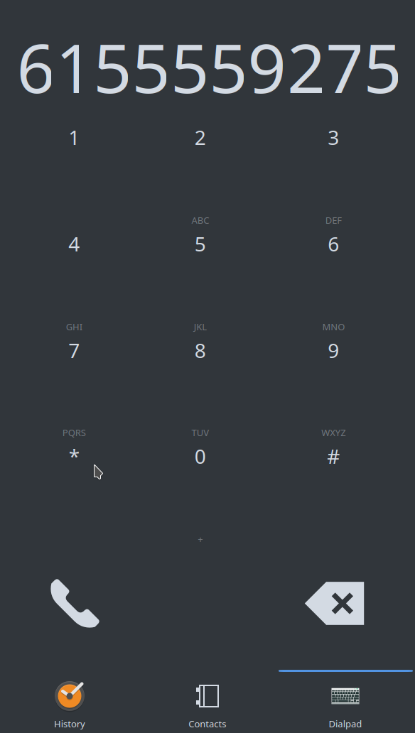
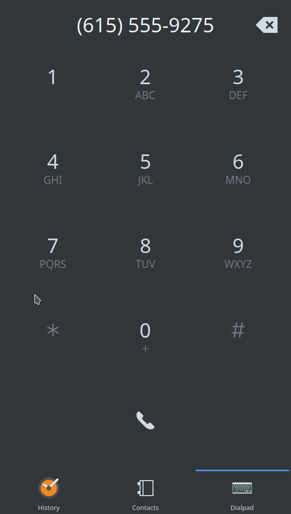
This makes the buttons more evenly spaced and formats the number as you type!
old:
new (updated):
The plan is to bring the entire dialer page down to about half its current size to support searching through contacts as one dials a number.
| bshah | |
| mart |
| Plasma: Mobile |
This makes the buttons more evenly spaced and formats the number as you type!
old:
The plan is to bring the entire dialer page down to about half its current size to support searching through contacts as one dials a number.
| No Linters Available |
| No Unit Test Coverage |
| Buildable 665 | |
| Build 677: arc lint + arc unit |
| dialer/package/contents/ui/Dialpad/DialerButton.qml | ||
|---|---|---|
| 90 | if you like to have it kirigami-friendly you should avoid pixel sizes anywhere, use point size for fonts, and Kirigami.Units.smallSpacing/largespacing for spacings | |
Remove pixel sizes for point and units and add libphonenumber requirement to cmakelists
Maybe out of scope here, but I'd really like to see borders around the number buttons. I've used software dialers where the numbers didn't look buttonlike, and they always felt slower and more awkward to use.
@ngraham they are highlighted when pressed, is that what you mean? or do you have an example?
@ngraham I wouldn't mind if you made that change, but I'll keep it like this for now.