This matches the KDE notification icon.
Details
Details
Diff Detail
Diff Detail
- Repository
- R224 KDE Connect
- Branch
- icon (branched from master)
- Lint
No Linters Available - Unit
No Unit Test Coverage - Build Status
Buildable 9 Build 9: arc lint + arc unit
Comment Actions
Can you maybe show us what it looks like with the applied patch? I'm not sure how this is better.
Comment Actions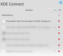
Here it is.

Here it is.
That is only a proposal, of course. But I like that the fact that we don't have the same icon for buttons that have different functions (dismissing one notification vs. dismissing them all), and it is more consistant with the rest of the desktop since the notifications plasmoid uses these two different icons for the same behaviour.
Comment Actions
Taken from VDG discussion:
Christian, [14.06.18 16:30]
there was a discussion when I implemented that in the notification plasmoid
that we need a better icon
unfortunately we got none since
so for the sake of consistency, which is very important here, I'd go and indeed use the same icons the notification plasmoid uses
if you want to push a bit for the new icon, https://bugs.kde.org/show_bug.cgi?id=391855 is the place, for now for the sake of consistency I am in favour of this patch :)
Comment Actions
Could the buttons on the top right be a toggle instead? Except the directory icon, of course.
Comment Actions
I don't have a developper account, someone will have to land this on my behalf. Thanks to him/her in advance for that.
Comment Actions
The left red button comes from a local patch that mutes notification that I did not send for review yet. It's not related to the other button that correspond to the 'Find my phone' feature. Sorry for the confusion.
Comment Actions
The icons are almost identical. Maybe a different icons can help? I believe we have a standard mute icon and a "find" or "search" icon as well.
Comment Actions
The icons are almost identical. Maybe a different icons can help? I believe we have a standard mute icon and a "find" or "search" icon as well.
The icon will definitely need to be improved !