Change the layout of the fonts kcm using checkable form layout items as suggested in
https://phabricator.kde.org/T7927#132277
Details
Details

Diff Detail
Diff Detail
- Repository
- R119 Plasma Desktop
- Branch
- fonts_kcm_layout (branched from master)
- Lint
No Linters Available - Unit
No Unit Test Coverage
Comment Actions
Alignment looks great to me! We might want to take the opportunity to also center-align the titles, which it better-looking for these centered formlayout style UIs. And maybe use a bit of extra vertical padding instead of that horizontalline separator?
Comment Actions

Section titles in form layouts are left-aligned. This would have to be changed in Kirigami. @mart, am I right?
To me it looks cleaner with the seperator.
Comment Actions
yep. personally i think left aligned is a bit better (as the fields are not exactly center aligned, butas left as the labels allow, as per HIG)
To me it looks cleaner with the seperator.
i agree, i prefer the separator as well
Comment Actions
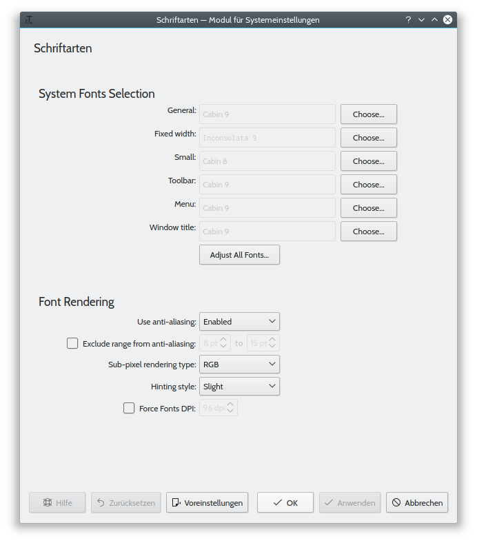
The checkboxes wildly floating around on the left look a bit weird to me. How about this (I guess your original intention was to avoid having checkboxes under the wrong text label?):
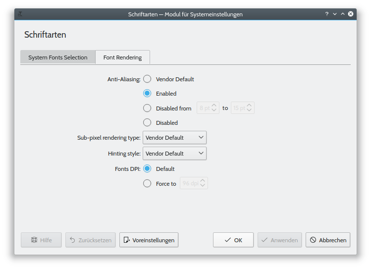
Anti-Aliasing: Enabled
               [ ] Exclude range from 8pt to 15pt
(…)
    Fonts DPI: [ ] Force to 96 dpi
A more general comment: Compared to the state before the redesign, the dialog now looks like two separate KCMs slapped together, as can be seen by the need to include two title headers and the separating line. Also, the settings on the top are easily understandable by any word processor user, while the terminology on the bottom requires more expert knowledge.
It might be worth thinking about a different way to group both sections. I'm not suggesting going back to the modal dialog, but maybe group boxes, two tabs, or a KCollapsibleGroupBox would be better?
Comment Actions
I was just thinking the same thing! In my original design, I did not want to manipulate the organization so deep but I feel your suggestion is a sensible suggestion. If someone has the time to redo the floating checkboxes placement, that would be great!
Comment Actions
You mean like this?
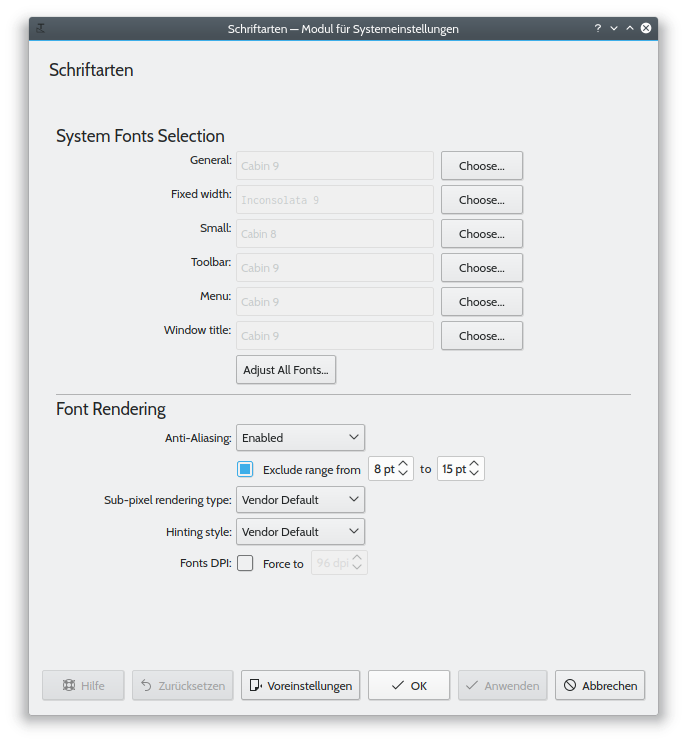
Not sure if I like this better... This way "Exclude range" seems to be somewhat unrelated to "Anti-Aliasing". Also, it is not very clear what the checkbox after "Fonts DPI" belongs to.
Comment Actions

Yes! I share your concerns too!
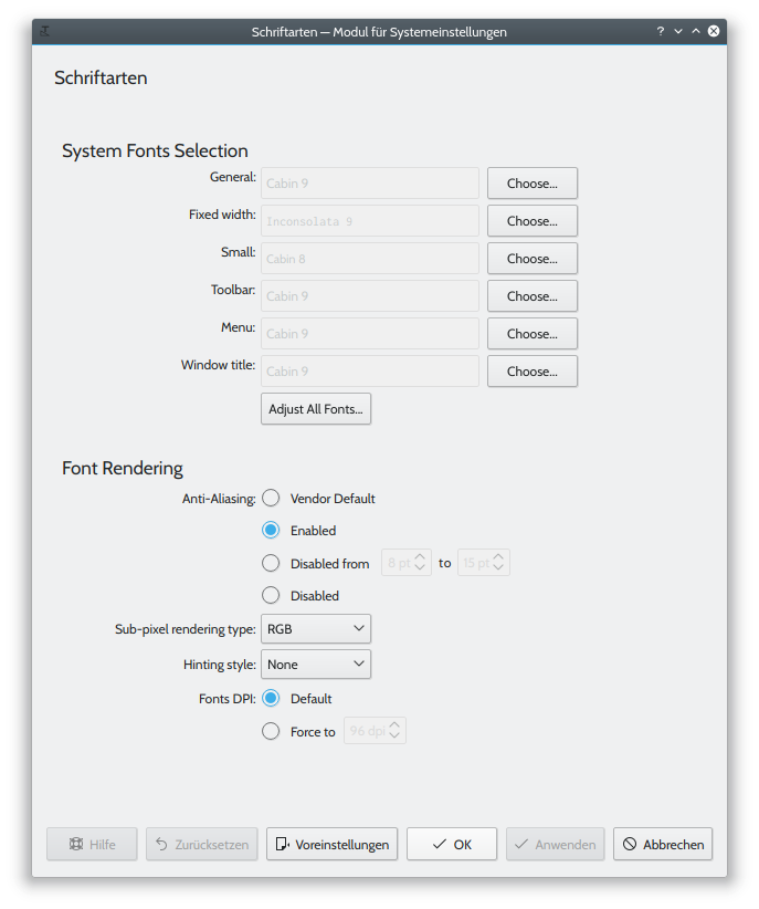
What about this?
For example:
Sub pixel rendering: ENABLED
CHECKBOX Exclude range from
SPINNER BOX to SPINNER box
And we end up with 3 lines and not 2 and lines 2-3 are aligned to the checkbox?
Also, if we feel that the settings are co-dependant, we could use a model like this:

Where you see that there is a clear section title, and subsequent checkboxes are below and aligned to the first item

Comment Actions
Great idea!
BTW, what's the difference between Vendor Default and the regular Defaults button? Either we provide an option to reset to the default for every single option separately, or for none at all. (This would reduce the number of radio buttons further, material for a separate Diff, though.)
(Also, watch out for the string freeze on Thursday.)
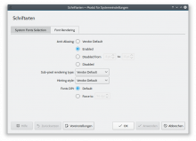
+1, because currently the margin between "Schriftarten" and "System Fonts Selection" is huge, while the margin between the horizontal separator and "Font Rendering" is tiny.
| kcms/fonts/package/contents/ui/main.qml | ||
|---|---|---|
| 32–33 | The whole expression can be simplified: https://www.ecma-international.org/ecma-262/5.1/#sec-15.8.2.11 | |
Comment Actions
BTW, what's the difference between Vendor Default and the regular Defaults button? Either we provide an option to reset to the default for every single option separately, or for none at all.
Here "Vendor Default" means that no value is written to the user's ~/.config/fontconfig/fonts.conf. There might be a system wide config file though that has different settings.
Comment Actions
But the same argument holds basically for any system-wide default setting? The only difference here is that normally defaults are provided via KConfigXT, while here it comes from fontconfig. Could we simply read the vendor default value, display it in the UI and finally if the user's choice is different, write it to the user's config?
Comment Actions
Yep, that's a good idea.
The C++ side of this kcm has some problems that need to be fixed anyway. I will try to implement this when fixing those problems. But that should be a separate commit.
Comment Actions
Huge +1 on Henrik's suggestion for removing "Vendor Default" in another patch. This one is looking great though!
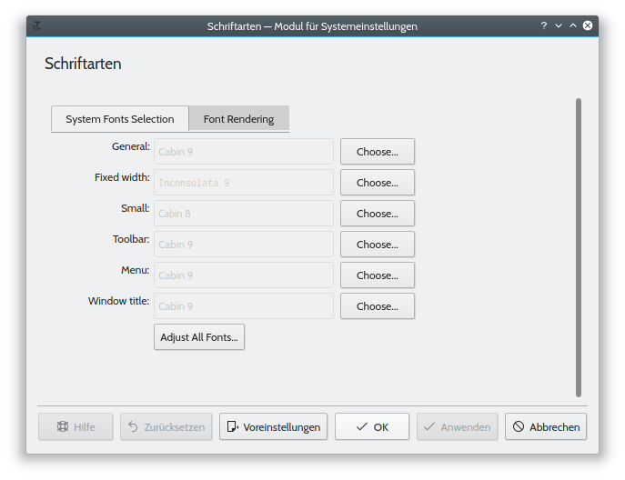
However, by increasing the vertical size so much, the content is now going to require scrolling at the default System Settings window size of roughly 1024x768 , which rarely looks good in a KCM. Could we try putting each of the sections into a tab within a new top-level tabbed view? This might also help separate out the use cases and user approachability issue, since as Henrik astutely mentioned, the top System Font Selection section is simple enough to be used by basic users, while the bottom Font Rendering section is quite nerdy and technical. If we do this, we could also remove the titles from the page, and let the tab titles speak for themselves, saving even more vertical space.

Comment Actions
Using tabs there are some problems with Kirigami now:
file:///usr/lib/qt/qml/org/kde/kirigami.2/ScrollablePage.qml:159: ReferenceError: applicationWindow is not defined
...
<Unknown File>: QML QQuickLayoutAttached: Binding loop detected for property "alignment"
Comment Actions
@mart, are you aware of the issues with tabs in Kirigami?
@progwolff, what happened to the frame for the tabbed view? Also, why is there still a scrollbar there?
Comment Actions
Did it the wrong way. Is fixed now.
Also, why is there still a scrollbar there?
I have no idea. The size of the content seems to be calculated wrong or something...
Comment Actions


Hmm, typically there is a frame around the entire content of the tab, not just at the top (also, why is there a gap between the tabs and the line?). I and many others think that this looks rather dated, but we have to deal with that until we have a proper Segmented Control widget (see https://bugs.kde.org/show_bug.cgi?id=384514). ElementaryOS makes heavy use of these instead of tabbed views, and I think it looks great:

However, unless and until we get a control like that, I think if we use a tabbed view, we need to adhere to the standard design and draw the whole frame.
Comment Actions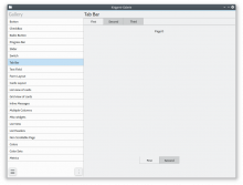
From what I could find there is no TabView in QtQuickControls2 or Kirigami.
This is how it's done in Kirigami Gallery:

I agree that this should be improved, but it's probably better to do this in Kirigami and not here.
Comment Actions
Eeeee, that doesn't look great. Sounds like the view in Kirigami needs some work. @mart
Could we have the line extend all the way to the window edges, at least when No Borders is used?
Comment Actions
Filed some bugs for Kirigami:
- https://bugs.kde.org/show_bug.cgi?id=394295 - Tab widget's inactive tabs don't connect with the line below them
- https://bugs.kde.org/show_bug.cgi?id=394296 - Kirigami tab widget should decide whether it wants to look like a conventional Tab View or a Segmented Control
Comment Actions
-1 to having tabs
We were always told by VDG that tabs are bad and a 5 km vertically scrolling list is better no matter what. So be consistent, please.
Comment Actions
I thought I read something like this in the HIG too, but couldn't find it yesterday.
I'm fine with any VDG decision here. It would be great if we could find a solution today, so it makes it into Plasma 5.13.
Comment Actions
I know the tabs are currently ugly, but let me explain my reasoning behind suggesting them:
It's not a simple "VDG says tabs are bad, don't use them"; scrolling is preferred to a more formal method of organization only when the content itself is naturally scroll-friendly, like a list or a view of images or icons. Settings widgets don't really qualify, especially since some of them actually respond to scroll events. It's not uncommon to be scrolling a view with a combobox or a stepper, have the control pass under the cursor, and then your scroll action is interpreted to mean "change the value of this thing". Furthermore, it's not very user-friendly to have the KCMs be scrollable. People complain about this and we get Bugzilla tickets (e.g. https://bugs.kde.org/show_bug.cgi?id=392314). We should design our KCMs such that the main content fits within the default window size (roughly 1024x768 now).
Comment Actions
I like it, thanks for the refinement ;)
Two more things I noticed which might be relevant for the string freeze:
- The Choose a font window title should use title case (possibly in a separate commit).
- Disabled vs. Disabled from (which actually means "Enabled", as can be seen by the rest of the options not showing the "disabled" state) might be a bit confusing, and I'm also not sure how well that "word puzzle" sits with translators. Maybe using Exclude range: (i.e. different wording and with a colon) would work better?
Did not review the code, but I noticed some warnings in addition to those mentioned above:
share/kpackage/kcms/kcm_fonts/contents/ui/main.qml:230:25: QML Image: Invalid image provider: image://preview/0_0.png
…
share/kpackage/kcms/kcm_fonts/contents/ui/main.qml:273:17: QML SpinBox: Binding loop detected for property "value"
Not really related to this patch, but it would be great if you could work on or file bugs for some of the following issues (not sure whether Kirigami or Fonts KCM problem):
- Preview comboboxes: Weird vertical placement of the popup (compared to QWidget comboboxes).
- Preview comboboxes: Clicking outside does not close the popup.
- Radio buttons: Horizontal spacing between radio button and text on the right is too large compared to the QWidget counterpart.
Comment Actions
The first isn't critical and exists since the previews were introduced. I will try to fix this in a separate commit.
The second on doesn't show up for me...
I will try to address these problems (in some days or so).
Not sure if this patch should be landed in this half-finished state. Might be an improvement, but might also be perceived as a regression.
I'm away for some hours now, so if anyone feels that this patch should go in, please feel free to land it.
Comment Actions
@mart @broulik Should this land now (with possible improvements for the final release), or is this for 5.14 (meaning we'll change around the UI again)?
The second on doesn't show up for me...
After much head-scratching I found how to reproduce: Remove the forceFontDPI key from ~/.config/kcmfonts (hint hint).