KDE logout screen background color fix
ClosedPublic

Authored by Pitel on Mar 12 2018, 12:48 PM.

Details

Summary

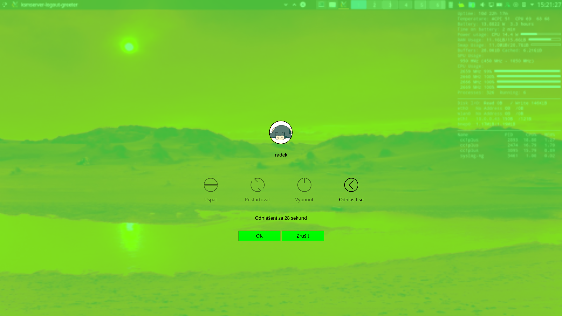
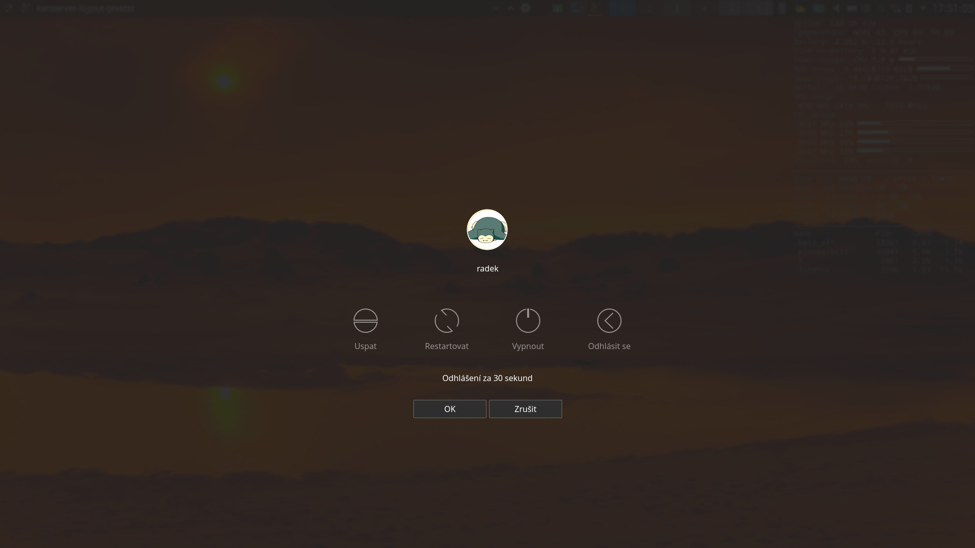
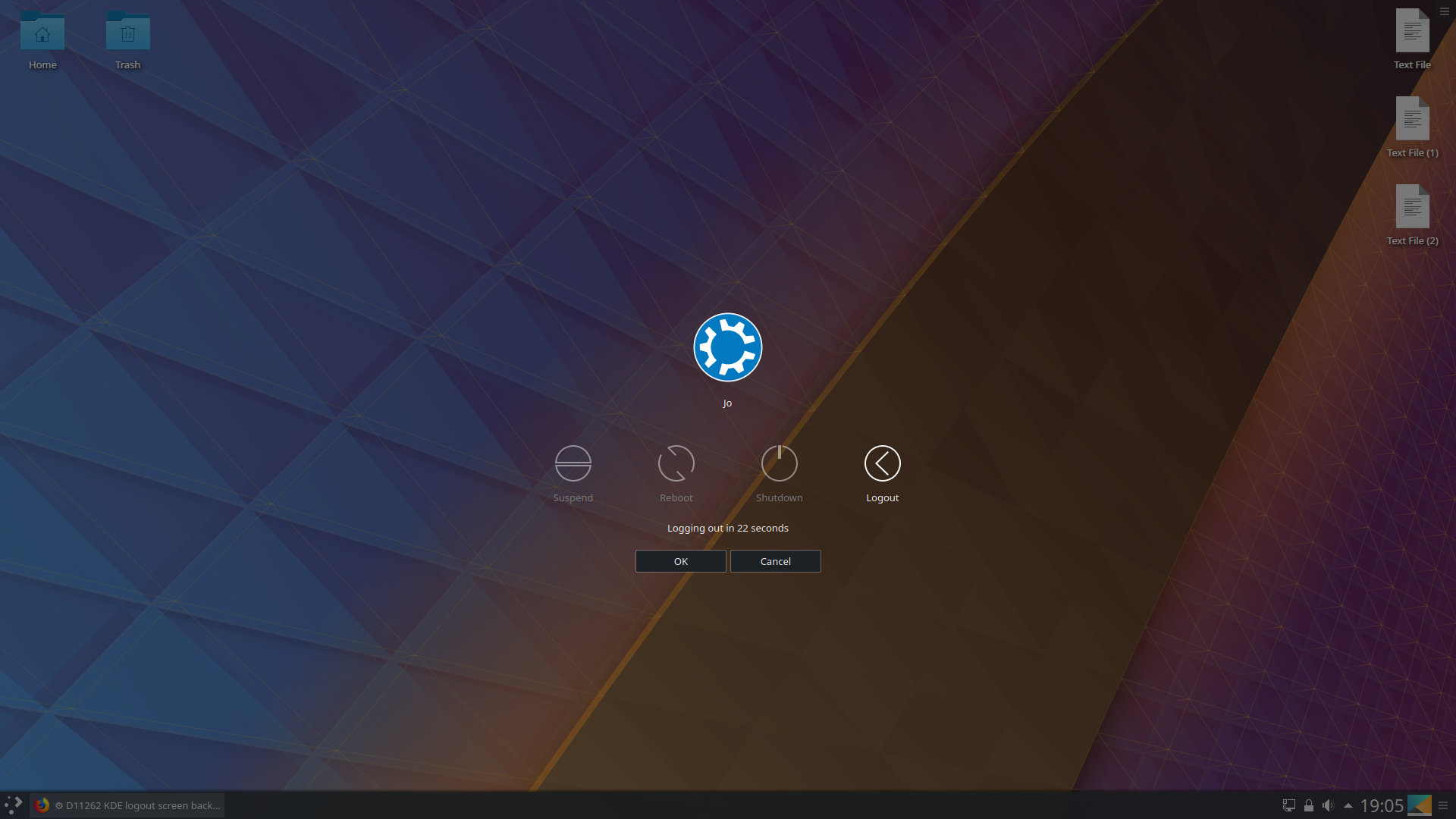
The patch D5036 did calculate wrong whether the background color is light or not which resulted in always black background. The problem was that color reported by plasma is in range 0.0 -- 1.0 not 0 -- 255. Now the background is black only when button background color is dark and otherwise it respects button background color.

BUG: 382264

Diff Detail

Repository
R120 Plasma Workspace
Lint
Automatic diff as part of commit; lint not applicable.
Unit
Automatic diff as part of commit; unit tests not applicable.
Pitel created this revision.Mar 12 2018, 12:48 PM
Restricted Application added a project: Plasma. · View Herald TranscriptMar 12 2018, 12:48 PM
Restricted Application added a subscriber: plasma-devel. · View Herald Transcript
mvourlakos added a subscriber: mvourlakos.EditedMar 12 2018, 1:01 PM

For Latte I am using a different way to determine Luminance..

https://en.wikipedia.org/wiki/Relative_luminance

something like

property real luminance = 0.2126*r + 0.7152*g + 0.0722*b

values above 0.65 threshold I consider them light and lower I consider them dark...

In the internet some are proposing 0.7 as threshold...

In color picker I use:

// formula for luminance according to https://www.w3.org/TR/2008/REC-WCAG20-20081211/#relativeluminancedef

                        var a = [color.r, color.g, color.b].map(function (v) {
                            return (v <= 0.03928) ? v / 12.92 :
                                                    Math.pow( ((v + 0.055) / 1.055), 2.4 );
                        });

                        return a[0] * 0.2126 + a[1] * 0.7152 + a[2] * 0.0722;

@broulik do you know why this part is needed?

var a = [color.r, color.g, color.b].map(function (v) {
                return (v <= 0.03928) ? v / 12.92 :
                                        Math.pow( ((v + 0.055) / 1.055), 2.4 );
});
abetts added a subscriber: abetts.Mar 12 2018, 2:10 PM

What will it look like now? Screenshot?

Pitel added a comment.Mar 12 2018, 2:25 PM

With dark button background as it used to


but if you choose some crazy combination (like black text on green background) it will also work (without this patch the background here would be still black)

Seems pretty good!

+1

With dark button background as it used to


but if you choose some crazy combination (like black text on green background) it will also work (without this patch the background here would be still black)

Would you be interested in producing similar patches for the Lock and Login screens, which suffer from the same issue?

ngraham edited the summary of this revision. (Show Details)Mar 12 2018, 4:39 PM
Pitel added a comment.Mar 12 2018, 5:25 PM

Would you be interested in producing similar patches for the Lock and Login screens, which suffer from the same issue?

Those two seem to be a bit more complicated because the logout screen covers the desktop by some color overlay so we know how the background looks. But with login & lock screen there is only picture on the background and no color overlay.

Adding color overlays on them seems unnatural and ugly. Other thing I tried is to add Glow effect. It solves readability problem but I do not like how it looks and documentation says it also needs OpenGL.

Using background dependent color would require to calculate an "average color" of an image in qml and I do not see how to do that. So the only solution I see right know is to add config options to select text color for lock & login screens.

mart added inline comments.Mar 13 2018, 11:53 AM
lookandfeel/contents/logout/Logout.qml
87

the method lattes is using 0.2126*r + 0.7152*g + 0.0722*b is more correct
(a simple one would be convertin to gray scale with qGray, but unfortunately is C++ only)

fredrik added inline comments.
lookandfeel/contents/logout/Logout.qml
87

qGray() uses an integer approximation that is only correct for CRT monitors.

Pitel added a comment.Mar 13 2018, 4:58 PM

I see that relative luminance formula is more correct but I would like to point out that we do not need here to calculate precise luminance. The point of the ?: statement is to collapse colors close to back to real black because gray overlay with 50 % opacity does not look good. So the current formula looks good enough for me and I would even think about moving the threshold down a bit to 0.4 or 0.3. (Generally not collapsing to black is the save way, it may not look so good but the text will be still easy to read.)

For reference a screenshot with gray background (similar to default breeze) without collapsing it to black:

mart added a comment.Mar 23 2018, 1:13 PM

I see that relative luminance formula is more correct but I would like to point out that we do not need here to calculate precise luminance. The point of the ?: statement is to collapse colors close to back to real black because gray overlay with 50 % opacity does not look good. So the current formula looks good enough for me and I would even think about moving the threshold down a bit to 0.4 or 0.3. (Generally not collapsing to black is the save way, it may not look so good but the text will be still easy to read.)

yep, gray background definitely doesn't look good.
can you try with the luminance formula and put a screenshot on how it looks?

Pitel added a comment.Mar 27 2018, 3:56 PM

I finally got to do some testing and it is not looking good for luminance formula 0.2126*r + 0.7152*g + 0.0722*b.

Screenshot with background color #5500FF (blueish, button background on picture), you can see that black text is readable on it, but it has luminance only 0.14 so in overlay it is replaced by black.

So I would rather stay conservative, and used formula max(r, g, b). I am still not sure whether the threshold should be 0.5 or a bit lower...

mart accepted this revision.Mar 30 2018, 11:30 AM

let's go for it

This revision is now accepted and ready to land.Mar 30 2018, 11:30 AM
This revision was automatically updated to reflect the committed changes.
cfeck added a subscriber: cfeck.Mar 30 2018, 1:48 PM

I finally got to do some testing and it is not looking good for luminance formula 0.2126*r + 0.7152*g + 0.0722*b.

Screenshot with background color #5500FF (blueish, button background on picture), you can see that black text is readable on it, but it has luminance only 0.14 so in overlay it is replaced by black.

So I would rather stay conservative, and used formula max(r, g, b). I am still not sure whether the threshold should be 0.5 or a bit lower...

You can adjust the coefficients. Please check color (0, 0, 128), which is - according to the committed way - considered a light color.

Maybe try something like (r+2*g+b) > 0.8.

Pitel added a comment.Mar 30 2018, 2:14 PM

I guess I should have renamed it from isLightColor to something like isNotAlmostBlack... The point was to replace almost black colors with real black because it looks better with opacity. IMHO (0,0,128), which is deep blue, is far enough from black to not mess with it because font colors readable on deep blue background might not be readable on black one.

fvogt added a subscriber: fvogt.Mar 30 2018, 2:16 PM

This seems to be a bugfix - Plasma/5.12 branch as well?

Pitel added a comment.Mar 30 2018, 2:30 PM

It is meant as one. I am still kinda new here, so I am not exactly sure how to that (without confusing Phabricator).

fvogt added a comment.Mar 30 2018, 2:57 PM

It is meant as one. I am still kinda new here, so I am not exactly sure how to that (without confusing Phabricator).

Cherry-pick the commit into the destination branch, merge into master and push both.

Since it was already committed to the master branch, wouldn't just need to be cherry-picked into the Plasma/5.12 branch at this point?

fvogt added a comment.Mar 30 2018, 3:18 PM

Since it was already committed to the master branch, wouldn't just need to be cherry-picked into the Plasma/5.12 branch at this point?

That's exactly what I wrote?

I meant, we wouldn't need to subsequently merge it into master because in this case, it's already in master.

But yes, for the future, committing to the branch and merging to master is the preferred approach. You can actually use arc for this, for future reference: https://community.kde.org/Infrastructure/Phabricator#Landing_on_the_.22Stable_branch.22

5.12.4

Way too dark. A guy posted a 5.8 vs 5.12 on Neon's G+.

Ray, this fix hasn't made it into a release yet; it was just committed this morning. So we wouldn't expect someone using 5.12.4 to benefit from the fix yet.

Okay, Nate. It's good to know there's hope.

Will this also fix the aliasing in the logout screen?

https://plus.google.com/communities/105101838887387505413

Pitel added a comment.Mar 30 2018, 5:15 PM

@ragreen I am sorry to disappoint but this patch does not remove the (usually black) half-opaque overlay the G+ post refers to. It only changes its color to button background color in the case that button background color is too far from black to make sure the text is readable. I guess the readability of text was the reason to introduce the overlay in the first place because only blurring the background (like 5.8 seems to do) is not enough in general.

I am not sure what artifacts is he referring to (but I am usually blind to this kind of issues)...

Pitel added a comment.Mar 30 2018, 5:22 PM

It also should be in Plasma/5.12 now.

ragreen added a comment.EditedMar 30 2018, 5:27 PM

I guess the readability of text was the reason to introduce the overlay in the first place because only blurring the background (like 5.8 seems to do) is not enough in general.

@Pitel I'm sorry to say this but they had nailed it in 5.8, then they ruined it in 5.12.

I am not sure what artifacts is he referring to (but I am usually blind to this kind of issues)...

I'm not.

@ragreen, this isn't the right place for that kind of discussion. Phabricator Differential is used for patch and code review, not commentary on larger design decisions. If you'd like to start a conversation about whether the current UX is a regression (and I would agree with you, FYI), it should be done in an applicable Bugzilla ticket or Phabricator Task, such as T7682.

@ngraham You're right. Thanks for the heads-up.

Pitel added a comment.Mar 30 2018, 5:45 PM

I am not sure what artifacts is he referring to (but I am usually blind to this kind of issues)...

I'm not.

I did not mean that I want to ignore them, I just need them pointed out for me to start seeing them.

cfeck added a comment.Mar 30 2018, 8:54 PM

I guess I should have renamed it from isLightColor to something like isNotAlmostBlack... The point was to replace almost black colors with real black because it looks better with opacity. IMHO (0,0,128), which is deep blue, is far enough from black to not mess with it because font colors readable on deep blue background might not be readable on black one.

Ah okey. I had the impression this was used to decide if light or dark text needs to be used. I wouldn't want to see black text on dark blue buttons :)

raddison added a subscriber: raddison.EditedMay 24 2018, 4:11 PM

It looks like that in Kubuntu 18.04 ...


Seems okay to me. It's not dark, it's fairly transparent and it doesn't have any artifacts. Can anyone confirm it with a screenshot?