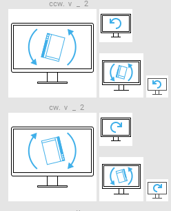
Retouching of Screen Layout Selection OSD Icons
AbandonedPublic

Authored by pstefan on Mar 1 2018, 11:25 AM.

Details

Reviewers
ngraham
Group Reviewers
Breeze
Summary

Overview
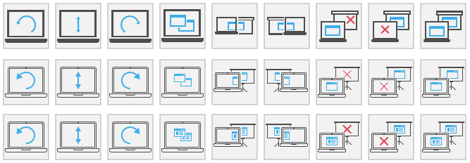
The icons to be replaced and their replacement
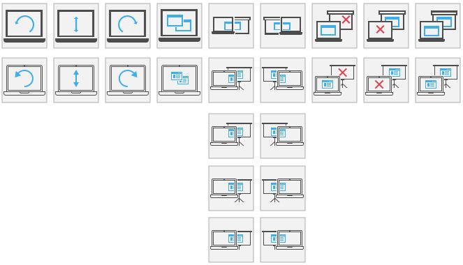
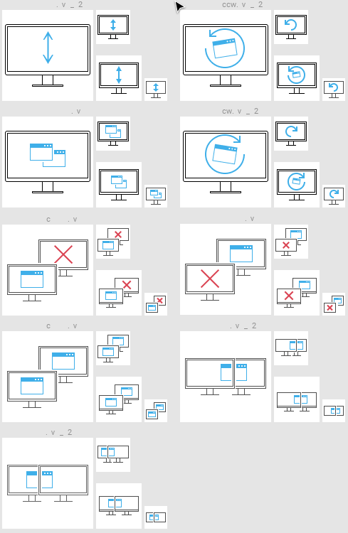
Final versions:


I found the current icons to have some issues that I tried to address with this revision:

  • Ambiguous symbolism
  • Inconsistent use of stroke thickness
  • Small arrowheads

In the side to side comparison above it's demonstrated that IMHO the arrowheads are too small to make out at a glance. The shallow angle between the arrowhead and the arrow-body in the rotate icons, especially, make the arrowheads almost invisible.

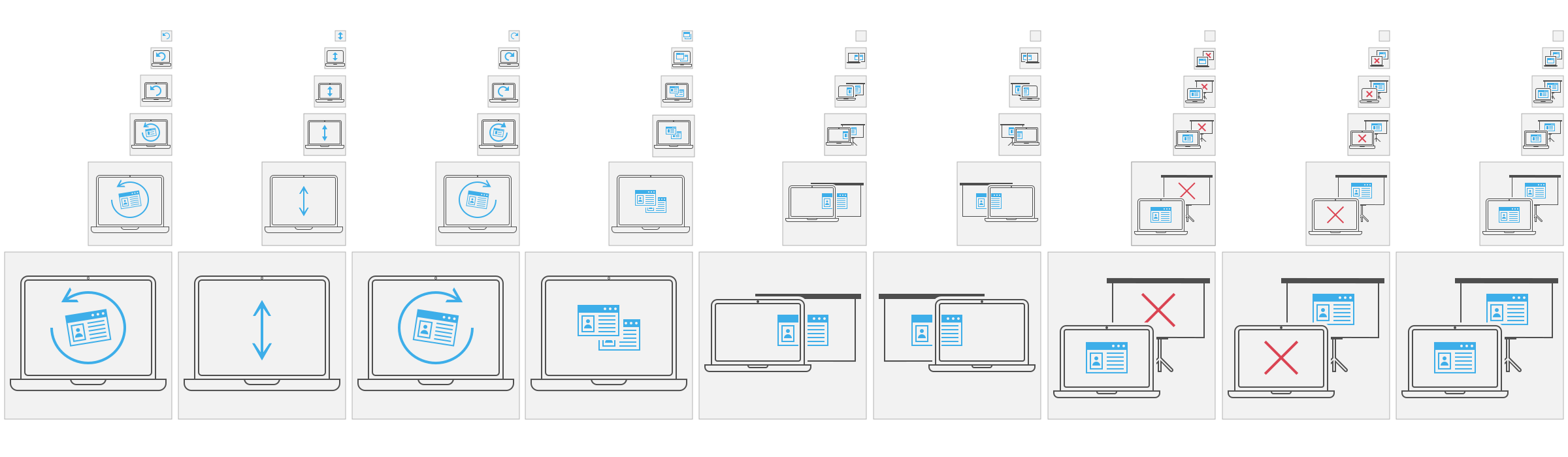
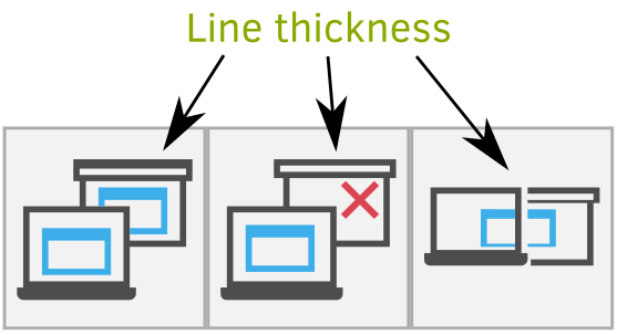
Another issue is the inconsistent use of stroke thickness, demonstrated in the image below.

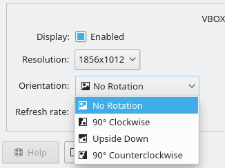
In my limited user testing (7 people), people did find the last 5 icons from the right to be ambiguous. I think this can mostly be attributed to the to the use of a projector screen as a symbol for external screens. The addition of the screen stand to the icons seemed to clear that confusion.

Personal Opinion
Personally I think that my icons are more in line with the spirit of the breeze icon style. The breeze HIG calls for icons that represent actions to be monochromatic and mostly use a stroke thickness of 1px. While the HIG specifies that this only applies to 16x16 icons, I feel that in this special case it's more appropriate to design these icons for their native 64x64px size instead of trying to design them at 16x16 and then scale them up by a factor of 4. Which leads to tick and clunky looking icons.
These icons will never be shown in an 16x16px area, so we might as well make use of the additional space.
IMHO this makes for much cleaner, lighter icons as one usually associates with breeze icons.

Summary
Pro:

  • Ambiguous symbolism
  • Inconsistent use of stroke thickness
  • Small arrowheads

Con:

  • Deviate from current style for icons this size
Test Plan

I tested the "new" icons with 7 people, all of which reported that this revision improves the symbol of the icons.

Diff Detail

Repository
R266 Breeze Icons
Lint
Lint Skipped
Unit
Unit Tests Skipped
pstefan created this revision.Mar 1 2018, 11:25 AM
Restricted Application added a project: Frameworks. · View Herald TranscriptMar 1 2018, 11:25 AM
Restricted Application added a subscriber: Frameworks. · View Herald Transcript
pstefan requested review of this revision.Mar 1 2018, 11:25 AM
ngraham added a subscriber: ngraham.Mar 1 2018, 3:13 PM

Thanks for this patch!

I like that the laptop and projector screen icons look better with your versions and don't have line weights that are as thick, which returns the focus to the icons that they're displaying. And I like that the arrows now have appropriate head sizes. The three left-most icons looks just about perfect to me.

But I don't like how the window and X icons in the other icons are now much lighter and smaller. I feel like they need to be a bit bigger and/or have thicker line weights to ensure that they don't recede too much in visual importance. Maybe not as big and thick as before, but maybe a bit bigger.

But I don't like how the window and X icons in the other icons are now much lighter and smaller. I feel like they need to be a bit bigger and/or have thicker line weights to ensure that they don't recede too much in visual importance. Maybe not as big and thick as before, but maybe a bit bigger.

I agree with you on the X. 1px diagonal strokes don't jam well standard resolution screens. I've updated them to 2px thick strokes now.

I kinda agree with you on the windows, however, what makes the thing windows in my revision so recognizable as windows, compared to the current ones, is the ratio of the header thickness to the outline stroke thickness delineating the window. it's 1:3 for my windows and 2/3 for the one in the current ones. There's not much room to go around in the icons to make thicker windows that are easily renegotiable this way.
However, I think I found a fix, instead of making them bigger, make them more massive. I added some content to the windows and I think it could be a nice middle ground:

That looks nearly perfect to me! One more minor issue: on the icons that depict spanning across two screens, the blue window has a vertical skew between screens that might make you think it's going to be buggy. Perhaps we should somehow make sure that the window is vertically aligned across the laptop and projector screens.

Also, can you update the screenshot that's in the Summary section?

Some different versions. Personally, I think the first or last version is best, however, the last would probably only work in conjunction to the other icons and not as stand alones.

pstefan edited the summary of this revision. (Show Details)Mar 1 2018, 7:16 PM
mart added a subscriber: mart.Mar 1 2018, 8:55 PM

they look awesome!

one point tough: those are only going to work at a single size, as they are more vulnerable to become blurry when resized, so they would need other size versions as well (small sizes probably being like before)

as they are part of the icon theme, one can't assume where and how they will be used (want it or not, app developers will just borrow them if they like it for whatever they want to represent) so the full sizes set is needed

they are a bit out of style with the rest of the icons, which is not necessarly a bad thing, as since they look really good, some other icons which are likely to be used very big could use that treatment

This came up in the VDG telegram room: the rotate and flip icons are still rather unclear, just from the icon alone. We came up with a potential alternative: how about displaying a rotated or flipped image in the screen? It would have to be something with strong directionality, like a mountain or something. In fact, we already use "mountain and sun" imagery elsewhere, for example with the Pictures folder:

I feel like a slightly less abstract version of that could work well here.

abetts added a subscriber: abetts.Mar 1 2018, 9:55 PM

Is there a way that we can add extra clarity by adding a label below the icons? A label that explains what the action is? I agree that the current symbolism can be hard to read but it is also very simple. If you make the connection to label, it will be even stronger in meaning. Also, not sure I like the white background on those tiles, is there a way that they can be dark and the images light? Just a thought on colors.

Is there a way that we can add extra clarity by adding a label below the icons? A label that explains what the action is? I agree that the current symbolism can be hard to read but it is also very simple. If you make the connection to label, it will be even stronger in meaning. Also, not sure I like the white background on those tiles, is there a way that they can be dark and the images light? Just a thought on colors.

I think it's up to the app to provide labels, like with other icons. Same with the background color.

In D10937#216476, @mart wrote:

one point tough: those are only going to work at a single size, as they are more vulnerable to become blurry when resized, so they would need other size versions as well (small sizes probably being like before)

as they are part of the icon theme, one can't assume where and how they will be used (want it or not, app developers will just borrow them if they like it for whatever they want to represent) so the full sizes set is needed

I agree, however, there's a point where the symbolism will simply break down. If we try to go with the laptop analogy I'd say 32x32px is the cutoff where one can reasonably use this symbolism. While it might be possible to cram it all into that confined space, there will be a lot going on. I'd say too much to really understand the intention behind the icon. Though I am open to be proven wrong.

This came up in the VDG telegram room: the rotate and flip icons are still rather unclear, just from the icon alone. We came up with a potential alternative: how about displaying a rotated or flipped image in the screen? It would have to be something with strong directionality, like a mountain or something. In fact, we already use "mountain and sun" imagery elsewhere, for example with the Pictures folder:

I feel like a slightly less abstract version of that could work well here.

I tried to experiment with your idea:


The top two rows are takes on "rotate left".

I am not sure it'll work with photo symbolism. At for me, I definitely wouldn't recognize what the rotated images were supposed to symbolized if I didn't know beforehand. Or, at least, I need a version that's not flipped for comparison. I am not saying though that the idea can't work. I am just not sure what to use here.

For the second row, I think the one to the left works best, however, due to the angles it'll always be blurry. Not sure if that's a good trade-off or not. Perhaps I should try it with the window being empty too.

I'd say that I think the top row works best, however, all the ideas, safe the bottom row, suffer from being complicated. As @abetts noted, sometimes simpler is better. I'd also help with adapting the icons to smaller sized without losing too clarity.

Is there a way that we can add extra clarity by adding a label below the icons? A label that explains what the action is? I agree that the current symbolism can be hard to read but it is also very simple. If you make the connection to label, it will be even stronger in meaning. Also, not sure I like the white background on those tiles, is there a way that they can be dark and the images light? Just a thought on colors.

The implementation it is supposed to be used in will have labels, as can be seen in in this blog post. However, every def can use them if they want.

RE:Color Do you mean the laptop screen? Or the while icon? If so, there's a dark variant for breeze dark. The tiles are just my 64x64px working areas and not part of the icons themselves.

Ooh, I rather like the rotated window imagery. I agree with you that the left-most one looks best. I think we can live with a tiny bit of blurriness here.

For small sizes, we could simply omit the window icon and just give it an arrow.

An update:

Green column:
I still haven't found a better metaphor. With the slightly rotated window metaphors to its sides I can just leave out the window at smaller sizes, but I can't really think of something that fills the screen at larger sizes while still being expressive at smaller sized.

Pink column:
I tried to get rid of the skew, but at medium sizes I can't seem to manage to get something that 1. doesn't look like a potato and 2. is actually recognizable. The laptop isn't so much the issue as the second screen.

Orange row:
I am honestly not sure it can be done at this size. The first 4 icons are probably possible, but after that it gets extremely tricky. I haven't managed to find forms that are clear in their meaning and still recognizable. It's either super cluttered or just a blue rectangle and a red X :|

I already had to get rid of the outer rim around the laptop in the 3rd row 5th column onward. I am not a fan.

As for the last row: I found that just scaling everything by a factor of 2 works best. With a 1px line thickness things start to look "hollow" and incomplete.

Those all look pretty great to me, honestly. A nice upgrade from the current icons.

For the pink column, does it look bad if you raise the projection screen so that it's only a little bit higher than the laptop on the large icons? It seems like there's room to raise it a bit and still keep the blue window aligned between them. I think it's okay if they're not aligned on the smaller versions.

Hi, while I do appreciate the icons I also have a question: Why the use of laptop and projector over of two simple generic screens. Wouldn't that be better for all use cases?

Those all look pretty great to me, honestly. A nice upgrade from the current icons.

For the pink column, does it look bad if you raise the projection screen so that it's only a little bit higher than the laptop on the large icons? It seems like there's room to raise it a bit and still keep the blue window aligned between them. I think it's okay if they're not aligned on the smaller versions.

You mean like in the smaller icons or like so:

?

Hi, while I do appreciate the icons I also have a question: Why the use of laptop and projector over of two simple generic screens. Wouldn't that be better for all use cases?

Dunno, I didn't set out to change the metaphors used.

Those all look pretty great to me, honestly. A nice upgrade from the current icons.

For the pink column, does it look bad if you raise the projection screen so that it's only a little bit higher than the laptop on the large icons? It seems like there's room to raise it a bit and still keep the blue window aligned between them. I think it's okay if they're not aligned on the smaller versions.

You mean like in the smaller icons or like so:

Like in the smaller icons, but with the blue window aligned due to the extra space. If you tried that and it didn't work, no biggie.

Latest revision:


I moved the window a bit up while maintaining the alignment, as requested. I had to remove the stand of the projector screen tho. Originally I "cheated" and moved the stand off-center to make it still visible. However, with the "header" of the projector screen shown, it was easily apparent that the stand wasn't centered anymore.

As for the 16px icons … I say they can't be done. At least for the 5th row from the left onward. There simply is not enough room to squeeze two windows (as in, window icons) next to each other while 1. having them look like windows and 2. being meaningful.

ngraham accepted this revision.Apr 4 2018, 5:23 PM

Heh, I don't think anyone is ever going to want to use 16x16 versions of these in the first place, so I can live with that.

These icons look fantastic. Big +1 from me. Any other comments?

This revision is now accepted and ready to land.Apr 4 2018, 5:23 PM

I am glad you like them :)

I will hand in the updated diff tomorrow. The color fix script somehow ate my icons and I have to restore them from a backup.

abetts added a comment.Apr 4 2018, 8:25 PM

I don't have any objections. Good work!

+1

I am glad you like them :)

I will hand in the updated diff tomorrow. The color fix script somehow ate my icons and I have to restore them from a backup.

You can download them from this diff, if they're current.

pstefan updated this revision to Diff 31376.Apr 5 2018, 11:49 AM

Hello again,

I was just wondering if there's something left I have to do now? Like some button I have to press or something.

Restricted Application edited subscribers, added: kde-frameworks-devel; removed: Frameworks. · View Herald TranscriptMay 9 2018, 6:53 PM
ngraham added a subscriber: VDG.May 9 2018, 6:55 PM

Someone will need to land the changes for you. I'd prefer a few more thumbs up first. @abetts, are you good with these?

ngraham edited the summary of this revision. (Show Details)May 9 2018, 6:56 PM
abetts added a comment.May 9 2018, 7:22 PM

Someone will need to land the changes for you. I'd prefer a few more thumbs up first. @abetts, are you good with these?

I am linking these a lot. I am "almost" there with the designs. I would just ask that the center image of the sample window be simplified. I think it has a lot of detail. Maybe we can tone it down by removing some elements and making the window look more simple.

Icons 5-6 have a representation that is meant to be a second screen, or a projector screen? Can you tell me what it is meant to represent?

Someone will need to land the changes for you. I'd prefer a few more thumbs up first. @abetts, are you good with these?

I am linking these a lot. I am "almost" there with the designs. I would just ask that the center image of the sample window be simplified. I think it has a lot of detail. Maybe we can tone it down by removing some elements and making the window look more simple.

Could you give me more examples of what you'd remove? As in direction.

Icons 5-6 have a representation that is meant to be a second screen, or a projector screen? Can you tell me what it is meant to represent?

It's supposed to be a projector screen. I took the original icon metaphor to be a projector screen, so I continued with that.

bruns added a subscriber: bruns.May 10 2018, 4:02 PM

It's supposed to be a projector screen. I took the original icon metaphor to be a projector screen, so I continued with that.

I think you should remove the tripod - I have not seen a projector screen not mounted directly to a wall for a long time. IMHO, the tripod adds only clutter, but no information.

Someone will need to land the changes for you. I'd prefer a few more thumbs up first. @abetts, are you good with these?

I am linking these a lot. I am "almost" there with the designs. I would just ask that the center image of the sample window be simplified. I think it has a lot of detail. Maybe we can tone it down by removing some elements and making the window look more simple.

Could you give me more examples of what you'd remove? As in direction.

I would remove the user image and the text representation. Make the window title bar bigger. Just leave it blank.

Icons 5-6 have a representation that is meant to be a second screen, or a projector screen? Can you tell me what it is meant to represent?

It's supposed to be a projector screen. I took the original icon metaphor to be a projector screen, so I continued with that.

For the projector idea, I am a bit split, because my experience tells me that in most cases people are just adding another monitor and not a projector, except when they are presenting in front of an audience. Adding an extra monitor is a more common situation than a presentation IMHO. Therefore, I wonder if you could provide an alternative design where you have a screen representation instead of a projector? Just to see the contrast.

bruns added a comment.May 10 2018, 4:11 PM

Two remarks regarding the rotation icons:

  1. I would remove the keyboard from the icons - you will use these with a tablet, a 2-in-1, or a pivoted external display.
  1. For the large versions, rotate the content pictogram/window not by ~20 degres, but ~70 degrees. Think of holding e.g. a tablet. You will typically rotate the screen first, and then rotate the contents back. If rotated by 70 deg, the shown content will be upright.

@pstefan, any update? It would be a shame to let this amazing work languish!

Sorry folks for the endless period of no activity. After some talking with ngraham I removed the laptop metaphor for a much more general standalone display. Also the projection screen was swapped out.

My last feedback was that the window icons were too detailed. So I made 3 version. (Old) fully detailed, some details and no details (well, safe for the window buttons :)

While you're at it can't you move them to plasma-framework? Having them in Breeze makes it not work with other themes and also they are only shown in the context of Plasma anyway

Sure, I can do that, but I'd like to get feedback on the final form first :)

bruns added a comment.Aug 18 2018, 9:43 PM

I think this works better if you actually rotate the screen:

ngraham added a subscriber: gladhorn.EditedAug 20 2018, 12:22 PM

I think this works better if you actually rotate the screen:

In KScreen, we recently did something similar and just used fully-rotated versions:

This works well because when the screen is physically rotated already, it becomes really easy to select the right choice because only one of them has an icon that looks like it's oriented correctly. We might want to consider doing the same here. So the icons that depict rotation wouldn't need to have rotation arrows or windows that were turned at funny angles; they'd simply be depict the final rotation state. In which case, the "base" of the screen should probably show up on the side that the display has been rotated towards, too.

As for moving the icons into the Plasma theme, I approve, but I think that should be done first and in a separate commit/patch. (The location is https://cgit.kde.org/plasma-framework.git/tree/src/desktoptheme/breeze/icons) So you would submit one patch to move the icons into the plasma theme, then a second to remove them here (which is safe because breeze-icons and plasma-frameworks have the same release schedules), and then in a third patch, you'd replace the existing icons with your awesome new ones.

Does that sound like a reasonable plan? Please let me know how I can help you with that. If we're going to make the move, we need to do it fairly soon so that both changes (moving to plasma theme and also improving the icons) land in KDE Frameworks 5.50, which is going to be the version that Plasma 5.14 depends on.

pstefan abandoned this revision.Aug 21 2018, 10:40 AM

Moved to D14971