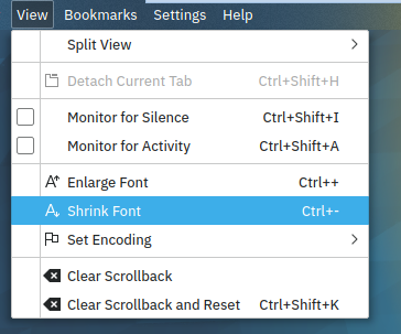
Now that we have space reserved for checkboxes on all menus it looks a bit weird when no checkbox is present.
This patch adds a vertical separator between the checkbox and the icon on the menu.
Details
Details
- Reviewers
ngraham hpereiradacosta - Group Reviewers
Breeze VDG
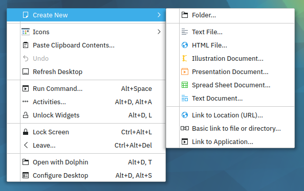
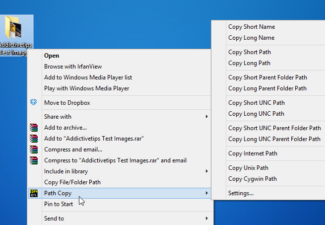
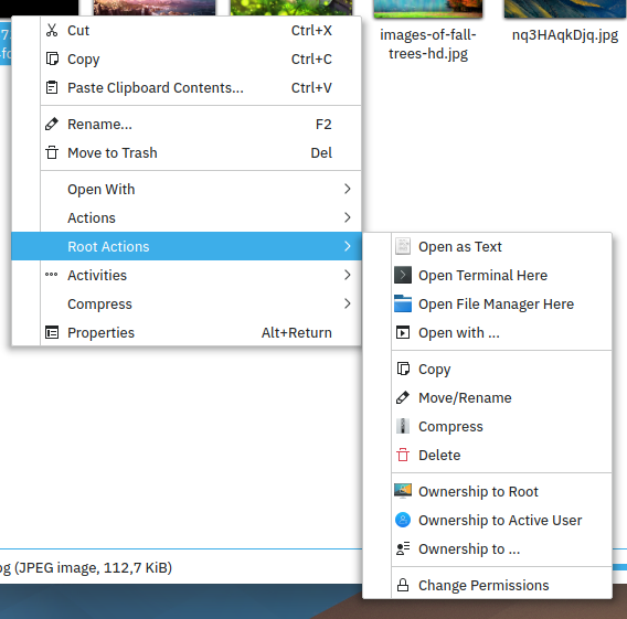
Windows 7 for reference:
Diff Detail
Diff Detail
- Repository
- R31 Breeze
- Branch
- master
- Lint
No Linters Available - Unit
No Unit Test Coverage
Comment Actions
Reminds me of Windows. I think I could get used to the vertical line, but I don't like how the horizontal lines intersect with it. Makes the menu look like a grid.
Comment Actions

Reduced the width of the horizontal line so it doesn't intersect with the vertical line.

Comment Actions
The best looking solution would be that menu entries that have checkbox/radiobutton, do not get an icon and then we can show the icon and the checkbox/radiobutton on the same column on the left.
Like you see in the Windows 7 pic in the test plan.
Or maybe I'm just used to that look and I'm biased... :)
Comment Actions
When I had designed the menus for the Skulpture style, I opted for not using a separate column for checkboxes, but indent the items that use them. The separate column was used for icons, though. See http://skulpture.maxiom.de/images/skulpture-sample-2.png
Comment Actions
Ok. This time I am strongly against this change.
This vertical line serves no purpose, clutters the ui, and is not "simple by default".
Why would one need to separate the checkbox from the icon and text to which it is directly related to.
Also see how it breaks with separator and item selection.
To me it is a no go.
(Note that I am not happy with any on the later community accepted commits to breeze either: blur serves no purpose either, nor the extra space allocated for checkboxes, etc.)
If people insist on this getting committed, I will oblige, and resign from maintaining breeze at the same time, for the reason that it is going in a direction which I do not like. I cannot maintain a code which renders to something I do not like (nor understand).
Sorry
Hugo
Comment Actions
Don't worry Hugo, I don't think we're going to turn Breeze into a mutant that you don't recognize. :) This change doesn't seem very popular, and if it's necessary to make a previous change work, that calls into question whether that was the right change.
Comment Actions
I liked Breeze because of its light and easy concept, get rid of too many lines, keep only the ones which make sense or are totally necessary, this feeling gets lost here for me so that Breeze would slowly increase into a Storm (little overstated I know) Even when this change should happen, I would vote for an opt-in feature so that the default keeps clean.
Regarding the discussion for checkboxes which is out of scope for here ...
I like to see the icon even it is an active toggle but I also agree that theese checkboxes can clutter a menu. I personally liked the approach which was shown here:
F5472324
Add a blue/green border on the right side (or left side for RTL languages) of the menus when they are active and one in red(or any other color) when inactive. This would look fine, at least for me.
Comment Actions
Well, that's too Windows, imo.
(Note that I am not happy with any on the later community accepted commits to breeze either: blur serves no purpose either, nor the extra space allocated for checkboxes, etc.)
This change doesn't seem very popular, and if it's necessary to make a previous change work, that calls into question whether that was the right change.
There's a lot of time before next release of Plasma, so "the previous change" can still be reverted and no one will notice that.
I should make it clear: allocating extra space for check boxes doesn't have any logic, it's just to make it look/feel right. Yes, it gains consistency with other os and DEs, but it also wastes space on display.
I don't understand what's the point of development without trying something new. Sometimes, this "something new" can be a little controversial at the beginning, like "big shadows in macOS", but later, people embrace it(now, Breeze has bigger window decoration shadows, too). And sometimes, this "something new" should be deleted.
I guess that change is the last one because:
- most people don't really like it
- it can cause stepping down of the Breeze maintainer
So, I will send a diff to revert that "the previous change".
Comment Actions
just as a sensation.. it looks kinda weird to me, also more busy without a clear advantage. (and i'm the one that usually wants to put separator lines everywhere :p)