Details
- Reviewers
- None
- Commits
- R266:6800b88f1819: add 64px media icons for elisa
Diff Detail
- Repository
- R266 Breeze Icons
- Lint
Automatic diff as part of commit; lint not applicable. - Unit
Automatic diff as part of commit; unit tests not applicable.
Why bother to ask for a review on Phabricator if you're not going to post screenshots so people can see your changes or wait for any reviews before committing? If you don't want a review, just push to master directly.
If you're going to use arc and Phabricator, wait for reviews. If you don't want to wait for reviews, then just push directly.
Sorry for being so late to the party, but I just found this while reading the Frameworks 5.44 release notes.
First of all, I am really grateful for the new icon. Actually, it would be really cool if we could also get a colorized version of a "media-artist" icon, since we are using a monochrome one there throughout Elisa :)
However, I think how the new icons are implemented here is problematic. You added icons with the same name as the monochrome ones, but the new ones look totally different. Depending on the icon size Elisa is requesting, we now get a different icon. This is also the reason why I created D10293.
Elisa is also using some color overlay effects, which now totally break. I upgraded to Frameworks 5.44, and now Elisa looks like this:
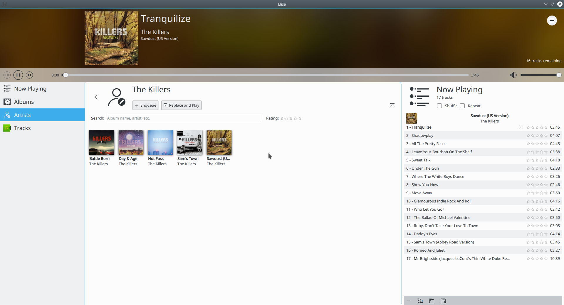
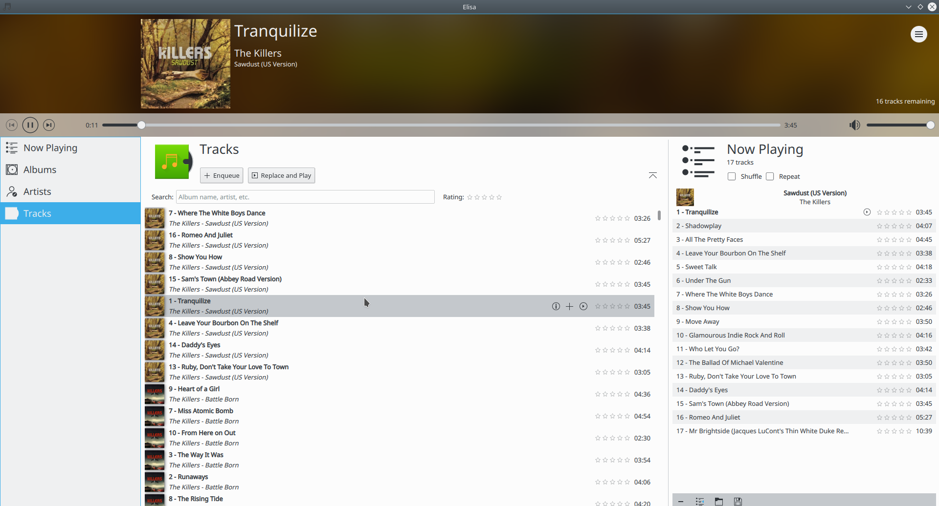
The icon for the tracks view looks now out of place, and doesn't work with the color overlay.
Again, thanks for the icons, but I think they should be implemented with different names, so that we must add explicit support for them in Elisa. This may also effect other applications similarly.
@astippich FWIW, I also think the current approach of using different icon styles per size under the same name is problematic, not only for HiDPI. More in D10770#213782 and D10770#215069. Not sure how to best approach fixing this, though :/
Also, make sure to check out what will become 5.45 of breeze-icons. You might be in for a surprise (at least if you like fine and thin lines).