- Increase the toolbar height by 4 pixels, to make it look less cramped and give items inside it more vertical padding
- Give the navigation buttons some padding
Details
Details
- Reviewers
mart - Group Reviewers
Kirigami - Commits
- R169:667cc4318a18: Polish ToolBarApplicationHeader appearance
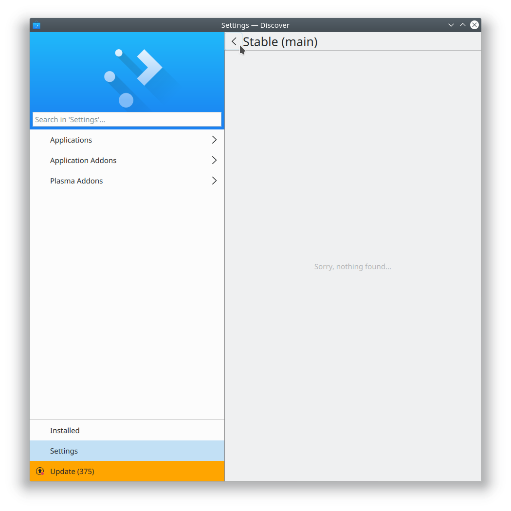
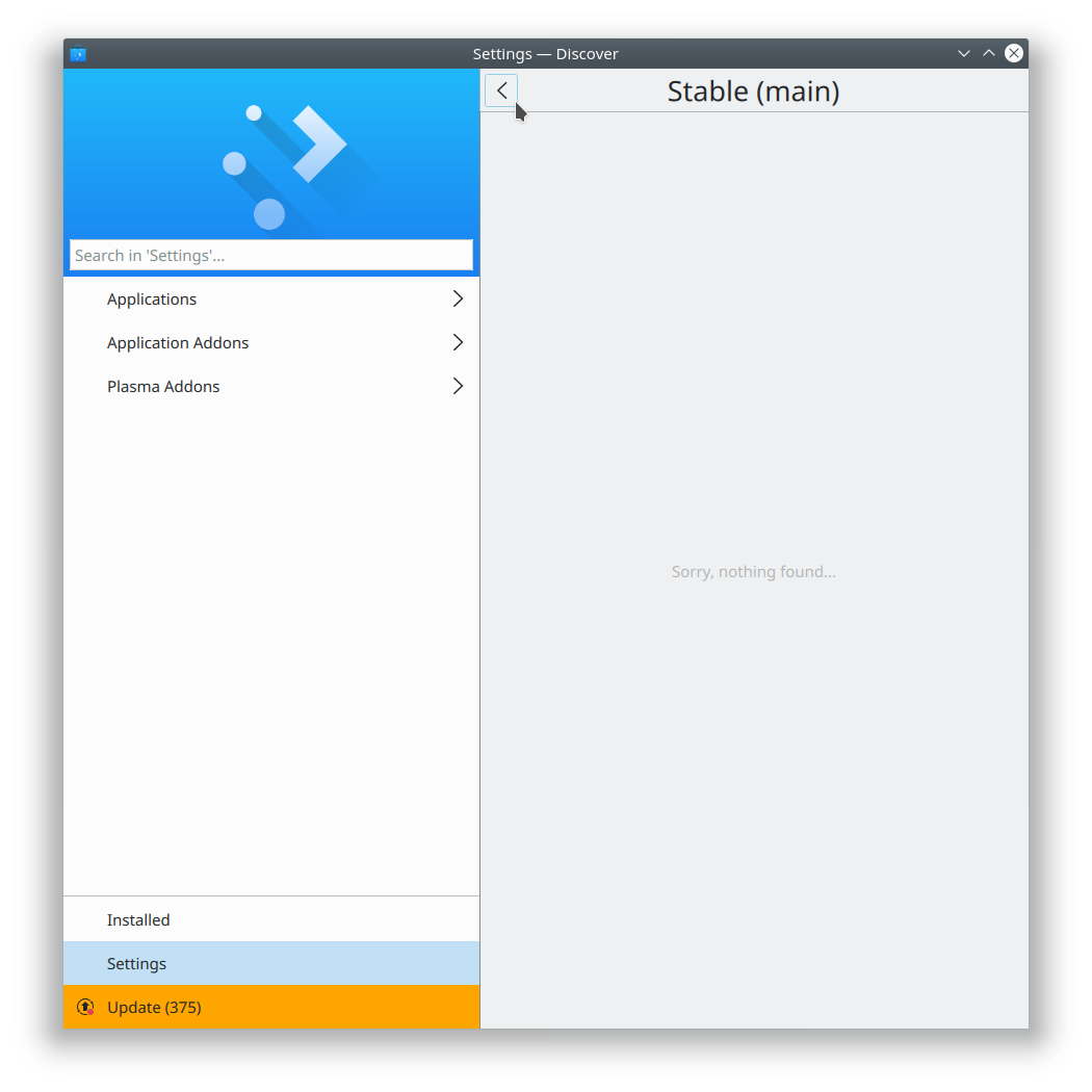
Tested with Discover.
Before:
After:
Diff Detail
Diff Detail
- Repository
- R169 Kirigami
- Lint
Automatic diff as part of commit; lint not applicable. - Unit
Automatic diff as part of commit; unit tests not applicable.
Comment Actions
Sorry guys, this proposed left alignment just won't work IMHO. The reason is that we are turning the bar into a CSD. Unlike a desktop application, we don't have the ability to shrink the application in mobile. What this amounts to is that people will want to add more controls to the top bar, this will cram the interface and the limited space will run out. Pushing the title to the left doesn't work either, it will bump into the back button. I feel it is best that we drop this conversation for now and focus on the HIG first where we can address these ideas first and then try to adjust applications to it.
Comment Actions
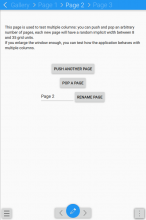
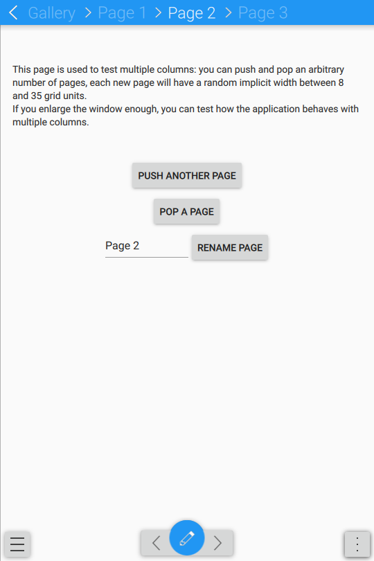
this look is strictly for desktop:
on mobile, the top bar contents are completely different, is a breadcrumb
and the actions are floating at bottom
Comment Actions
I've reverted the title alignment changes for now. There are too many patches in flight to keep up! If this is good, let's land it (and also Aleix's patches once they're all good too) and then I'll iterate on the titles a bit more. Does that sound like a plan?