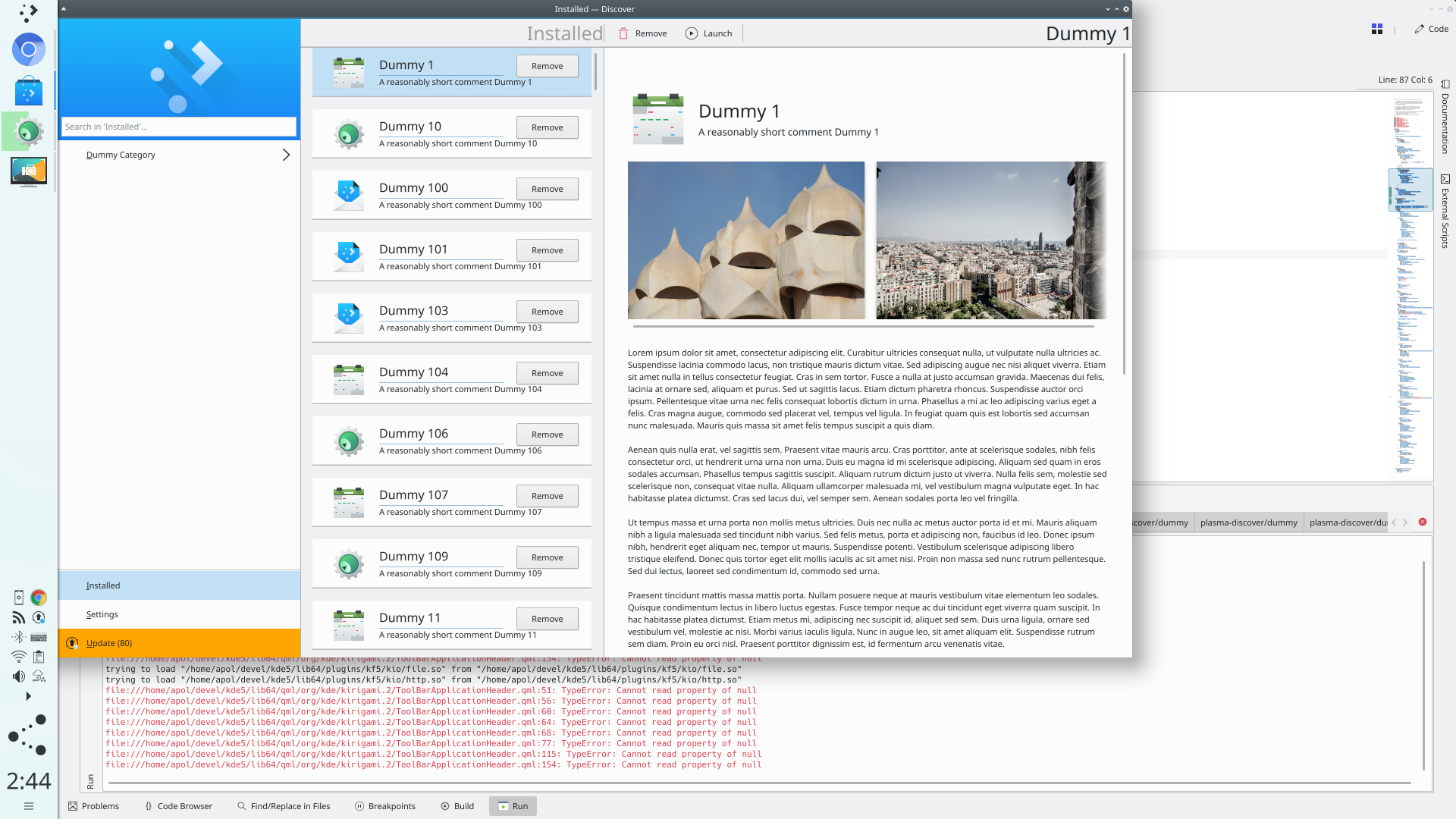
At the moment, the ToolBarApplicationHeader doesn't show any title if there's
actions on the toolbar, which makes for slightly weird empty space and looks
inconsistent with other pages.
We may want to make it configurable
Details
Details
- Reviewers
mart ngraham abetts - Group Reviewers
Kirigami - Commits
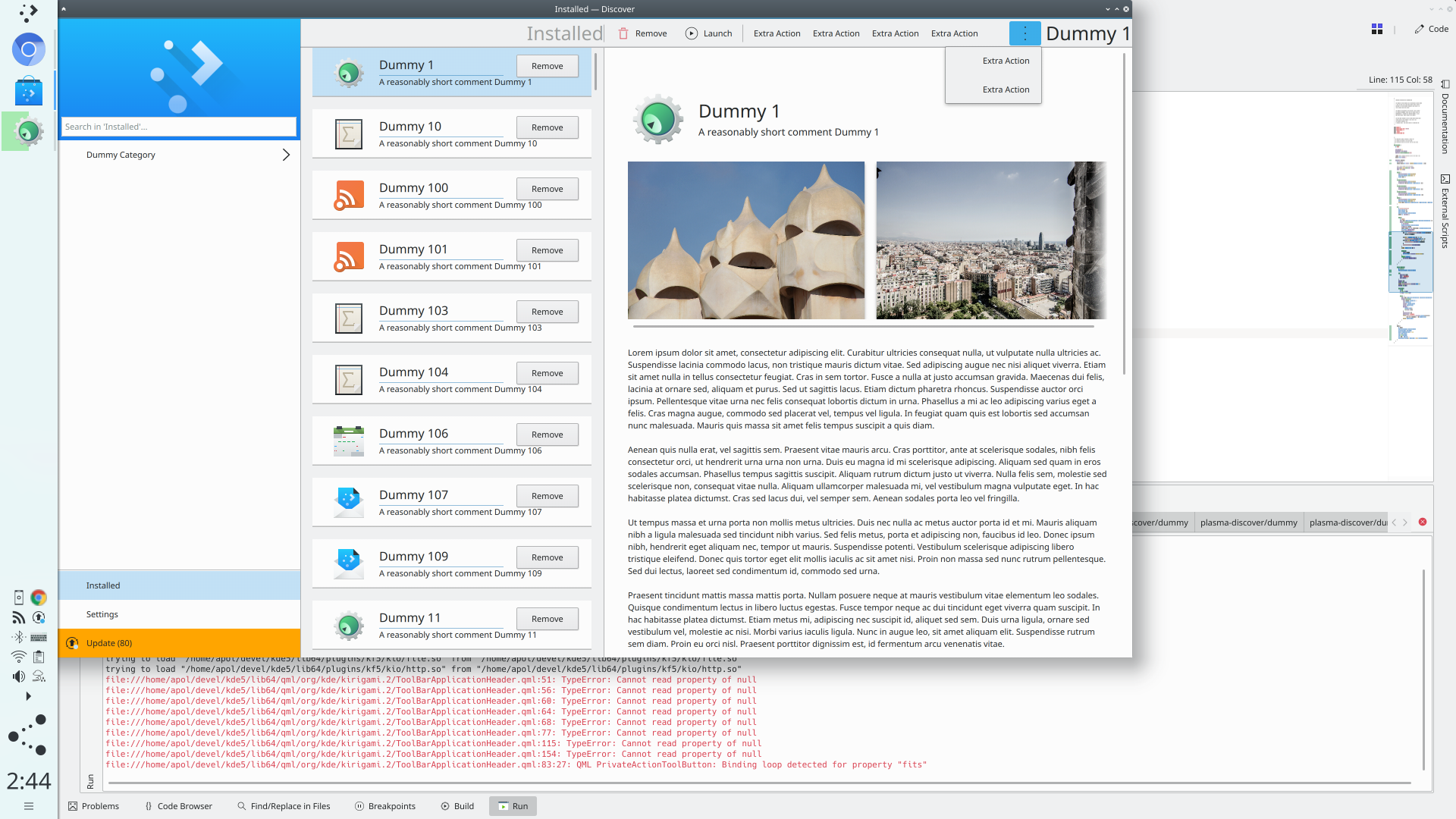
- R169:9665afb2a594: Make it possible to show the title despite having ctx actions
Diff Detail
Diff Detail
- Repository
- R169 Kirigami
- Branch
- master
- Lint
No Linters Available - Unit
No Unit Test Coverage
Comment Actions
I like it!
tough i think the more actions button should always be on the right of everything else, including the title
Comment Actions
This patch makes the title right-aligned, which is non-standard with anything. Let's keep it left-aligned for now. Also, what happens to the navigation buttons if you're not in widescreen view? You get navigation buttons, and then context actions, and then the title? That'll be an awful lot of content to have on the left side.
Comment Actions
No, but in Desktop mode, if the window is not widescreen, then the left side of the header currently gets navigation buttons: Back when you can go back, and after the first time you go back, Forward is shown, too.
Comment Actions
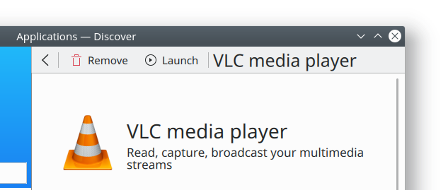
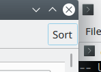
For me this patch still has the titles aligned to the right, even after your change:
But as currently implemented, if we move the title over to the left as I'm asking for, then the above image would change too having three elements on the left, and none on the right. It would look visually unbalanced.
I think the context items need to be moved over to the right side of the header to visually balance the navigation buttons and title that will go on the left.
Comment Actions
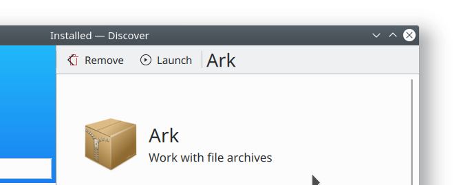
Great, now we have the titles on the left, like @mart wants. We're getting there! There are a couple remaining issues:
- Needs a re-base as it doesn't apply cleanly onto current master
- Now everything in the header is left-aligned. It looks okay in widescreen mode, but just doesn't work outside of widescreen mode:
 It looks so unbalanced. I really think we need to move the context actions over to the right. The left is overloaded with stuff.
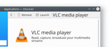
- When I merge master and resolve the merge conflicts, the context actions overlap the navigation buttons:
Comment Actions
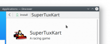
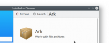
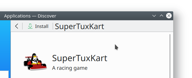
Regarding the use of this component in Discover: Excuse the very naive question, but why is the title duplicated in the top bar in the first place? It looks very cluttered, unaligned, and jumps around depending on which buttons are in use.
It seems the only situation a title on top would be useful is when the users scrolled down and thus hid the intro header, but that could be solved differently: Add a small non-scrolling header as soon as the real header got hidden when scrolling down, as found on many websites. This could even be a feature of this component and not required separately in every app.
I think it's pretty clear that there is too little space in the top bar for everything, so you have to dedicate a larger area to the controls anyway.
Alternative idea: Feature current application name in window title only.
(Note I'm only talking about the desktop version here.)
Comment Actions
@rkflx Not naive at all!
In this patch, we are trying to solve the general case of how a navigation header with context actions should look. Once we implement this control in Discover, we will definitely be removing the title from the app page's use of it, since as you point out, it's redundant as the page content below it already shows the app name. We may also even remove the context actions and put them on the page too, in a non-scrolling header as you suggest. So this patch is really trying to work out the "worst case scenario" for a header with two navigation buttons, a title, and 2 or more context actions.
On another note, what would be your preference for title alignment: left-aligned, or centered?
Comment Actions
In this patch, we are trying to solve the general case of how a navigation header with context actions should look.
I see, but I'm afraid with only a single example (which should be solved differently anyway) it is going to be hard to reach a conclusion. I'm not sure about the purpose of the "title" element.
"worst case scenario" for a header with two navigation buttons, a title, and 2 or more context actions.
I doubt a "title" with four more elements plus the required spacing will work at all as a title.
On another note, what would be your preference for title alignment: left-aligned, or centered?
There are two qualities which make something a title: First and foremost, enough room to breathe, and less importantly a more pronounced font (bigger size, bolder). This means for me one of these situations:
- lots of space title lots of space
- title lots of space small icon possibly with text
- small icon with no text at all lots of space title lots of space small icon with no text at all
I would avoid anything involving the following in relation to the title:
- small space
- no space at all
- more than two non-space items in addition to the title
- | as a replacement for lots of space
Otherwise the title element cannot perform its role properly and feels cramped. Unfortunately this means most of the screenshots above don't fit those requirements. On the plus side, it explains the "remaining issues" and weirdness you noted above.
In your case I would think about a two-row approach, i.e. a row resembling a toolbar, and a separate row for the title. Once you only have a title and two non-text icons, it could collapse to a single row.
Comment Actions
I agree with @rkflx. I think we need to step back here and do some more long, hard design work before we rush to implementation. The proposed approach will not work for most narrow headers as there will simply not be enough room for navigation buttons, a title, context actions, and the menu button.
I'd like to get @abetts and VDG involved in this process before we proceed, as I anticipate otherwise we'll just go around in circles with patches to implement, change, and undo the same things over and over again.
Comment Actions
Oops, I really didn't want to block progress here. I think the only thing which needs clarification is what "title" entails in relation to the rest of the app, perhaps with a couple of examplary use cases.
Another approach would be to define the text element as a kind of "label", showing things like a filename or a mode/state. Then it would still need spacing, but not so much, it could get a smaller font.
Comment Actions
Don't worry Henrik, you're all good. The underlying issue here is that we haven't actually done the necessary design work for this feature yet. The appropriate Kirigami HIG section is empty: https://community.kde.org/KDE_Visual_Design_Group/KirigamiHIG#Bars
If we merge this patch, there's a significant chance that a great deal of it will have to be re-done later. Thankfully there shouldn't be much if any downstream fallout because I don't believe any clients are actually using this feature on the desktop, so the worst thing that could happen is that we might just need to re-do this work later. If that seems unpalatable, it might make more sense to his the brakes and decide on our design before we implement it!
Comment Actions
Now that we have a menu, we definitely need to look into this.
Without patch: odd
With patch: still odd

Comment Actions
The title is still the primary focus for this header UI, which means (for RTL languages at least), it needs to be left or center aligned. This means the actions have to be on the right, to make sure your eyes don't see them before the title.
@abetts, what do you think?
Comment Actions
I am in favor of placing the Titles left aligned, but only if we don't put more than 1 control to the left of the title. If we can't compromise on that, another option is to keep titles center-aligned.
Comment Actions
Problem with center-aligned is that it's hard to have it look centered having components growing on either side. I'll give it a go to having the actions on the left and the contextualActions on the right.
Comment Actions
If there's only 1 contextualAction, show that one instead of a menu with just 1 thing
Comment Actions
Give the title some more space if there's no actions
Someone please review the change
Comment Actions
Generally looks good. A few UI comments:
- Let's use a hamburger icon as the default icon, rather than the three-dot icon. That's used elsewhere on the list to expose hidden actions; here, it's opening a standard drop-down menu, so let's use the more standard icon for it.
- The button doesn't have enough right padding:

- I'm not really satisfied with the presentation when the button has text, as seen above; there's no icon, and no downward-pointing arrow to indicate that clicking the button will open a drop-down menu.
Comment Actions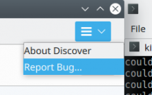
Hmm, now there's too much side padding!

Can we make the padding identical on the top, bottom, and right side?
Also, as you can see in the above screenshot, the menu items without checkboxes have zero left padding, so they touch the bounds of the menu.
Comment Actions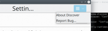
The problems persist with QT_SCALE_FACTOR=1.5, and additionally the titles get inappropriately elided:

Comment Actions
Improve how we calculate the header title.
Let's fix the right spacing issue in a separate review
Comment Actions
Looks good now! With your latest update, the right padding issue now actually resolved. The follow-up patch only needs to fix the left padding for the menu items that don't have checkboxes.