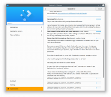
FEATURE: 380514
Details
Details
- Reviewers
ngraham - Group Reviewers
Discover Software Store - Commits
- R134:acf66dd18540: Bring back embedded top3 reviews on the ApplicationPage
Diff Detail
Diff Detail
- Repository
- R134 Discover Software Store
- Lint
Automatic diff as part of commit; lint not applicable. - Unit
Automatic diff as part of commit; unit tests not applicable.
Comment Actions

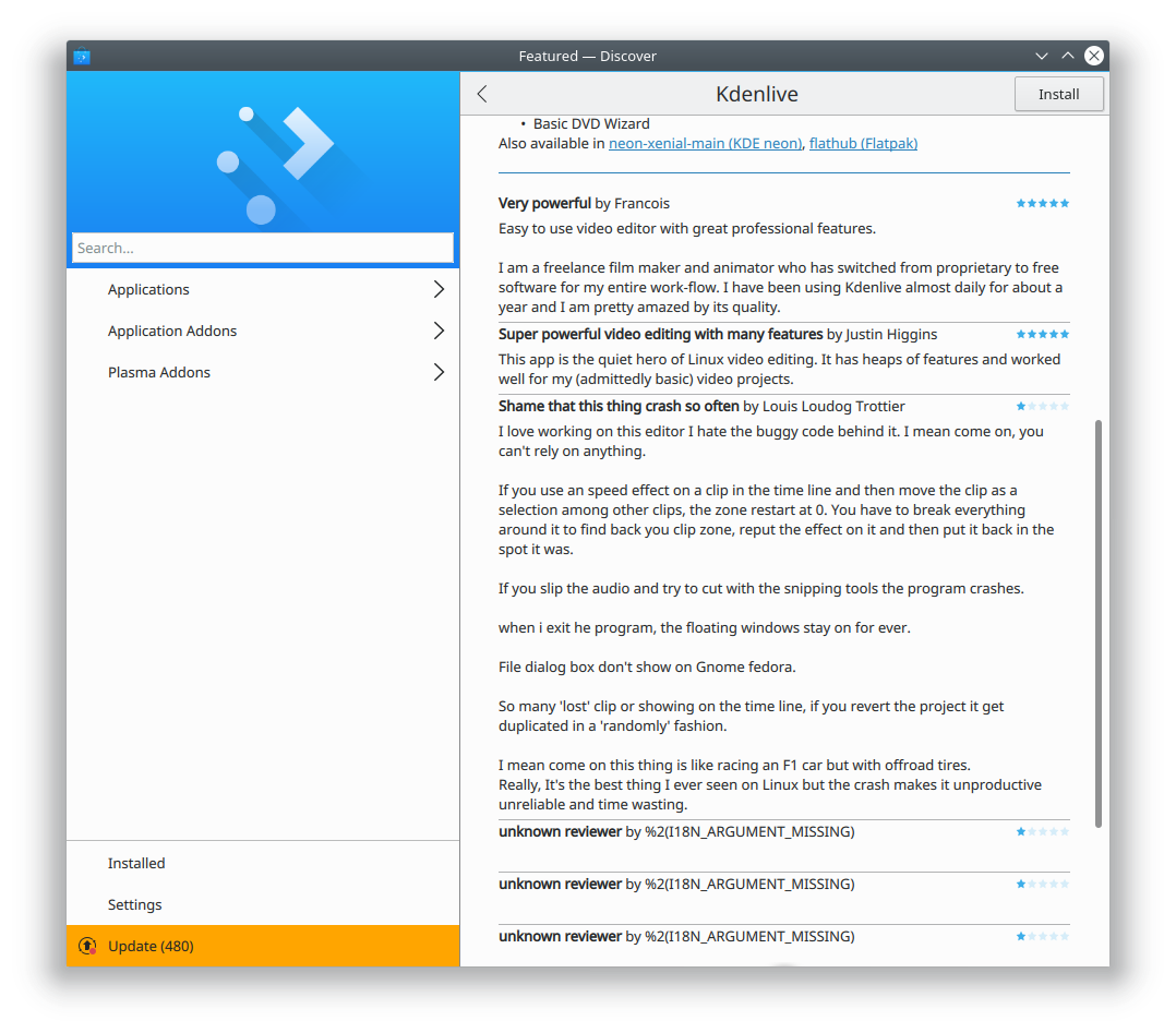
Nice! There are a few polish changes I'd like to see:
- Add a header label saying "Top reviews", since it's otherwise not obvious what users are looking at ("Newest reviews?" "Developer's favorite reviews?"). We could probably replace the blue line with this header unless you deliberately avoided changing any strings to squeak it in for 5.12)
- Change the label that says "Show Reviews" to "Show more reviews" (unless you deliberately avoided changing any strings to squeak it in for 5.12)
- Could we increase the vertical padding between each review a bit?
- For KDenlive's entry, I noticed three extra dummy reviews:
Comment Actions
Getting there!
- Change the text "Show reviews" to "Show more reviews"
- the "Reviews" header text should maybe be a bit smaller, so as not to visually compete with the app name, as some apps have short descriptions and the two headers appear close together
- Maybe change the "Reviews" header to "Top Reviews". Judgment call, not necessarily required
- The increased padding between the reviews is good, but now the divider line is misplaced. It looks really weird not being equidistant between each review. If we can't change that easily, I would advocate getting rid of the line entirely, as the padding is now sufficient to visually separate the reviews.