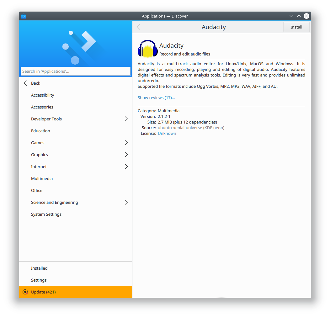
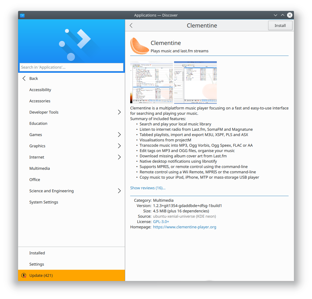
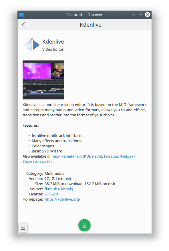
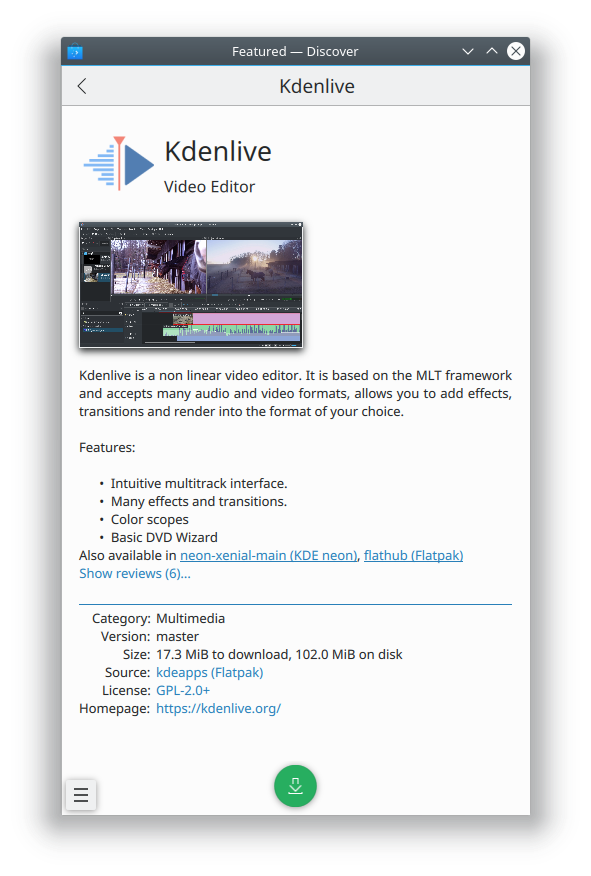
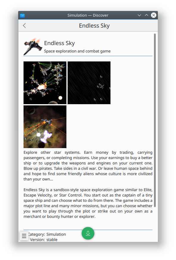
Taking inspiration from @abetts popular idea for some tweaks, I implemented a few changes to the Application page:
- Increased size of app icon, name, and caption
- Removed blue line separating header and screenshots/description, since it was controversial and kind of pointless and inconsistent when the metadata section didn't have a text header
- Displayed screenshot thumbnails with the aspect ratio of the full-sized image, so they look better and nothing is cut off in the thumbnail
- Gave screenshot thumbnails a drop shadow and more padding between them
Errata:
- The screenshots lost their hover effect as a side effect of the way the QML DropShadow effect had to be implemented. I tried many ways of adding it, and this was the way that caused the last amount of damage. Definitely open to suggestions.