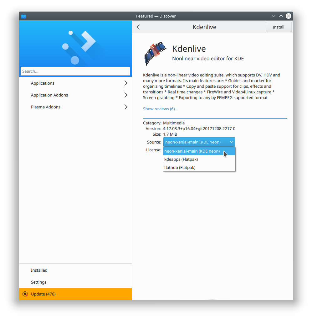
Here I am again, hawking my combobox... :)
This patch uses a combobox to select the source, but only for the desktop view. People are always complaining that Discover's desktop view doesn't feel like a desktop app, and exclusively using a desktop-metaphor UI element here would help the situation, I believe.
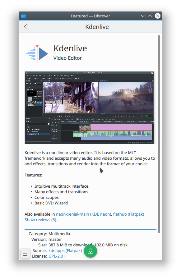
On mobile, the UI is unchanged, and we show the overlay, which has always felt more mobile-like anyway. It's more at home on that view.
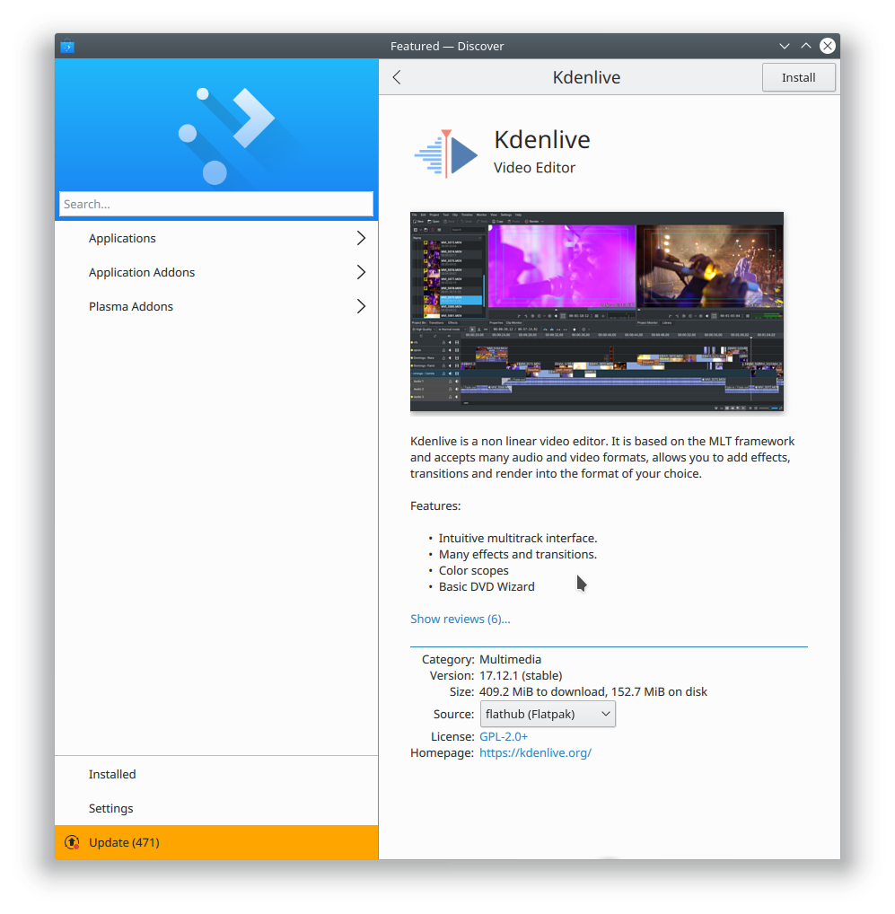
When there is only a single source, we show a simple label for both desktop and mobile.